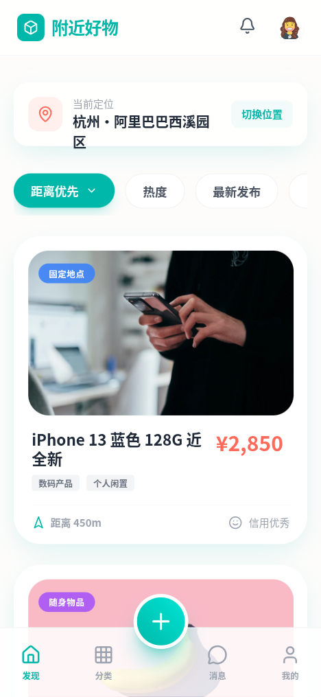
附近好物 - 活力本地交易小程序
A vibrant, Gen Z-focused local marketplace style called 'Nearby Goodies'. It features a high-energy palette of Teal (#00B8A9) and Coral (#FF6B5B), utilizing heavy rounded corners (2rem), soft colored shadows, and glassmorphism. Ideal for local e-commerce, community platforms, or C2C trading apps targeting younger demographics. The layout emphasizes proximity and real-time interactions with a card-based bento-adjacent feed.
Summary
A modern, high-contrast mobile interface for local item trading. It combines 'Plus Jakarta Sans' typography with playful UI elements like squircle-shaped buttons, translucent glass panels, and animated product cards. The design prioritize location-based data and visual hierarchy through bold pricing and status badges.
Style
Youthful and energetic with a focus on 'squircle' geometry and vibrant accents. Uses Teal (#00B8A9) for brand identity and Coral (#FF6B5B) for transactional highlights like price. Typography is bold and wide. Shadows are soft and tinted with the primary brand color to avoid a muddy look.
Layout & Structure
A mobile-first vertical stack starting with a glass-morphic header, followed by a floating location picker, sticky horizontal filter chips, and a list of high-detail product cards. A specialized bottom navigation bar features a prominent center Floating Action Button (FAB).
Header & Location
Sticky Filter Bar
Product Card Feed
Bottom Navigation
Components
Real-time Status Badge
A glassmorphism badge that indicates live updates on an item's location/availability.
Tilt-Shift FAB
The central publish button with a playful rotation interaction.
Special Notes
Must use 'Plus Jakarta Sans' for the editorial feel. All primary call-to-actions should use the teal gradient. Distance indicators must be visually distinct, using the primary teal to signify 'reachability'. Do not use harsh black (#000) for text; use Deep Grey (#111827). Ensure all cards have a subtle white 1px border to enhance the glassmorphism look on light backgrounds.