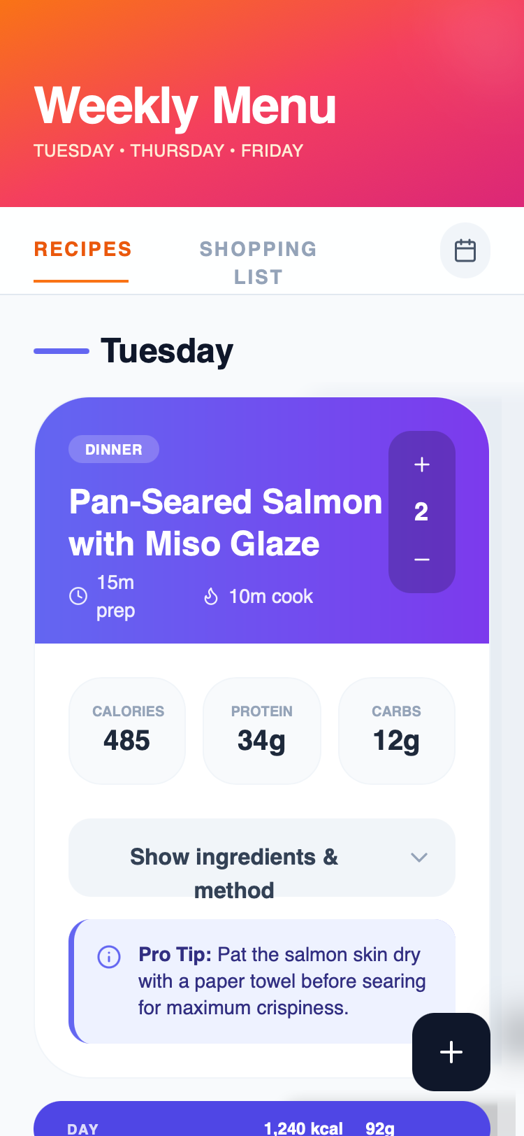
Apple HIG Dark Theme Meal Planner
An authentic Apple Human Interface Guidelines (HIG) inspired dark theme featuring 'Liquid Glass' surfaces, SF Pro typography, and premium glassmorphism. It uses a deep #1d1d1f background with translucent overlays, backdrop filters (blur(40px)), and high-contrast Apple blue accents (#0071e3). This design system is ideal for high-end lifestyle apps, health/fitness dashboards, premium SaaS, and fintech platforms that require a sophisticated, native macOS/iOS feel.
Summary
A premium Apple-native dark mode UI focused on high-density data visualization and elegant information hierarchy. It utilizes layered glassmorphism, semantic typography, and subtle micro-interactions to create a 'Liquid Glass' aesthetic that feels deeply integrated with modern operating systems.
Style
The style is defined by its deep dark background (#1d1d1f) and sophisticated use of translucent layers. Typography uses SF Pro for high legibility with wide tracking (0.2em) for labels. Colors are strictly semantic: Primary Text (#f5f5f7), Secondary Text (#a1a1a6), and Apple Blue (#0071e3) for focus states. Surfaces use 'Liquid Glass' with backdrop-filter: blur(40px) saturate(180%) and thin 1px white borders at low opacity (10%). Animations are smooth, using a standard cubic-bezier(0.4, 0, 0.2, 1) for transitions.
Layout & Structure
A vertical-scrolling layout with a fixed header and sticky tab navigation. Content is organized into semantic sections (e.g., days of the week) with nested cards providing high-density information.
Header
Sticky Tab Navigation
Data Cards
Expandable Details
Components
Vertical Stepper
A compact control for adjusting quantities or values.
Glass Pill Summary
A full-width decorative summary bar used to separate sections.
Floating Action Button (FAB)
Primary action trigger that follows the user.