Apple-inspired Waitlist
A refined, premium waitlist page design system inspired by Apple's minimalist aesthetic. It features a sophisticated muted blue-gray accent (#4F6BA6) on a light grey background (#FAFAFA). Key elements include editorial typography with tight line heights, slow-motion scroll animations (1.5s), layered soft shadows, and subtle gradient dividers. Ideal for high-end SaaS, design tools, fintech, and professional services looking for a 'quiet luxury' digital presence.
Summary
A high-end, minimalist waitlist and landing page design system characterized by sophisticated muted colors, slow-motion reveal animations, and meticulous attention to spacing and typographic hierarchy.
Style
The style is 'Quiet Premium'. It uses an Apple-system font stack (SF Pro Display) for a native feel. Colors are anchored in #FAFAFA (background) and #1D1D1F (text), with #4F6BA6 as a muted blue-gray accent. Animation is central: a 1.5s cubic-bezier reveal creates a sense of weight and inevitability. Visual depth is achieved through layered box-shadows rather than borders.
Layout & Structure
A vertical, centered flow that guides the user through an emotional narrative before the final call to action. It uses full-screen heights for the hero and generous whitespace between sections.
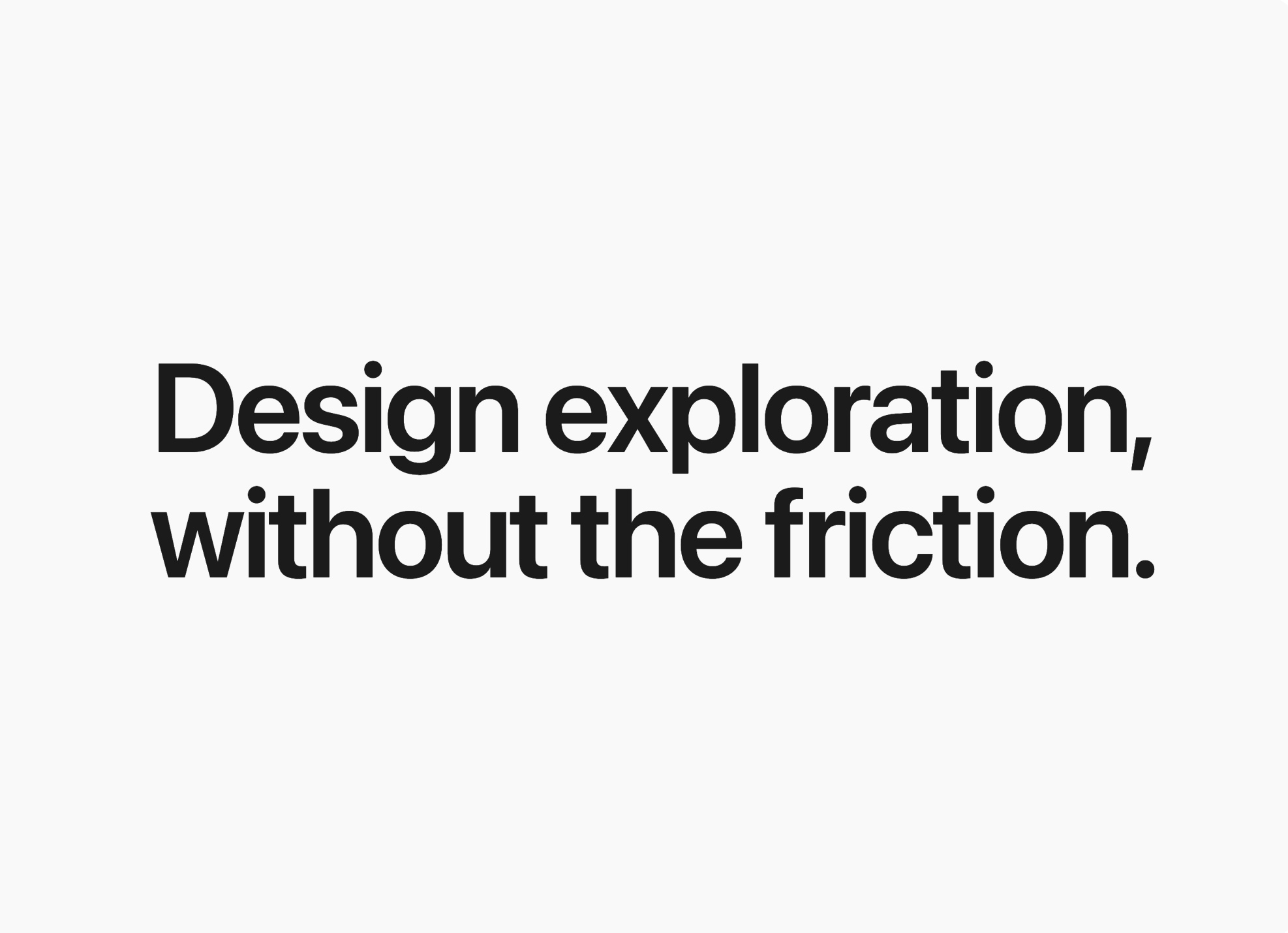
Hero Section
Section Dividers
Context & Features
Visual Preview Card
Workflow/Process
Waitlist Form
Components
Gradient-Border Input
An input field that appears to have a glowing gradient border on interaction.
Shimmer Action Button
A CTA button with a sophisticated moving gradient.
Special Notes
MUST: Maintain the 1.5s animation duration for all reveals; faster durations will break the premium feel. MUST: Use only the specified blue-gray #4F6BA6; do not use standard bright 'Apple Blue' (#0071E3). DO NOT: Use sharp borders; use gradient opacities for dividers. DO NOT: Over-saturate the success state; keep it quiet with a check icon and soft fade.