Aura OS - Launch Manifesto
An editorial, typography-heavy design system mimicking a high-end magazine or manifesto. Features high-contrast serif and grotesk font pairings, asymmetric layouts, and a sophisticated dark-mode palette with cream accents. Suitable for high-end product launches, boutique SaaS, architectural portfolios, and literary-focused platforms that value narrative and white space.
Summary
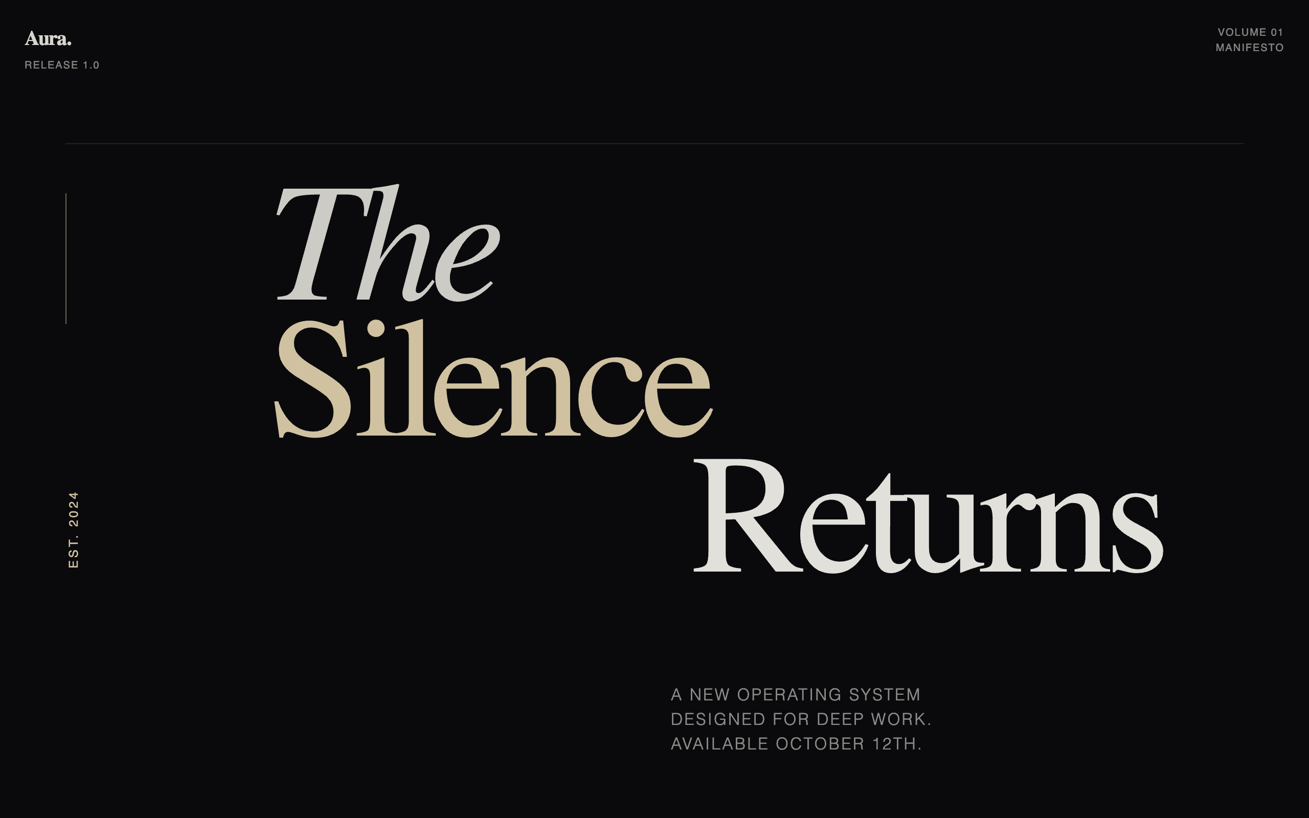
A premium editorial-style launch page characterized by massive typographic headlines, a rhythmic vertical scroll, and a sophisticated contrast between deep charcoal and warm cream. The design prioritizes long-form storytelling over traditional UI patterns, using grain textures and asymmetric alignment to create an intentional, cinematic atmosphere.
Style
The style is 'Modern Editorial Manifesto.' It relies on high-contrast typography pairing: Fraunces (a high-contrast serif) and Manrope (a clean, modern sans-serif). Colors are deep and organic: '#0a0a0c' (Canvas), '#e8e6e1' (Paper), and '#d4c5a2' (Accent gold/cream). The visual language uses grain overlays and mix-blend-mode for depth, with animations focused on subtle fades and vertical translations.
Layout & Structure
A vertical narrative layout consisting of 10 distinct thematic chapters. It utilizes generous padding (py-32), sticky headers, and mixed alignment (centered text vs. asymmetric grids) to guide the reader through a story.
Sticky Navigation
Hero Cover Section
Intro Paragraph
Two-Column Essay Section
Vertical Narrative List
Manifesto Grid
Editorial Testimonials
Call to Action Card
Final Statement & Footer
Components
Grain Overlay
A global texture that breaks the digital flatness of the dark theme.
The Vertical Narrative Row
A sophisticated way to list features without using cards or icons.
Special Notes
Must avoid: Standard box-shadows, rounded buttons, and icon libraries. Must use: Raw typography for hierarchy, thin borders (1px) for structure, and negative space to create a sense of premium quality. Keep all animations slow and deliberate (1s+) to match the 'thoughtful' brand tone.