Bold Editorial Style
A high-contrast, editorial-style SaaS landing page design optimized for designers and creative tools. It features bold Anton display typography, a sophisticated palette of golden yellow (#ffe17c) and deep charcoal (#171e19), and a structured layout combining grid patterns and bento-box feature blocks. This style is characterized by aggressive visual hierarchy, oversized headlines, and a minimalist yet punchy aesthetic suitable for high-velocity startups, fintech, or creative agency portfolios.
Summary
Create a bold, modern B2C SaaS landing page with a high-contrast editorial feel. The design uses aggressive display typography (Anton) paired with clean sans-serif body text (Satoshi), employing a color palette of golden yellow highlights against charcoal and white backgrounds. It features a grid-patterned hero section, high-contrast problem/solution blocks, and a bento-style feature grid.
Style
Brutalist-lite SaaS aesthetic. Key elements include massive display fonts (8xl-9xl), a grid-based background (linear-gradient with 40px spacing), and a strategic use of #ffe17c (golden yellow) for highlights and primary CTAs. Typography pairs the heavy weight of 'Anton' with the sophisticated versatility of 'Satoshi'. Colors include #171e19 (charcoal), #272727 (dark gray), #b7c6c2 (sage), and #ffffff (white).
Layout & Structure
The layout follows a logical conversion funnel: Hero for immediate value prop, social proof for trust, a high-contrast split-section for problem/solution, a flexible bento grid for features, a numerical step-by-step process, and a high-energy final CTA.
Navigation
Hero Section
Problem-Solution Contrast
Bento Feature Grid
How It Works
Final CTA
Components
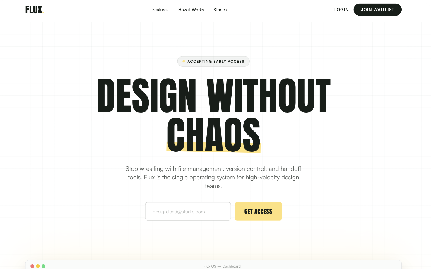
Abstract UI Mockup
A browser-style mockup frame used to showcase software interface without high-fidelity images.
Testimonial High-Contrast Cards
Alternating light and dark review cards with oversized star icons.