Bold Retro-Modernism
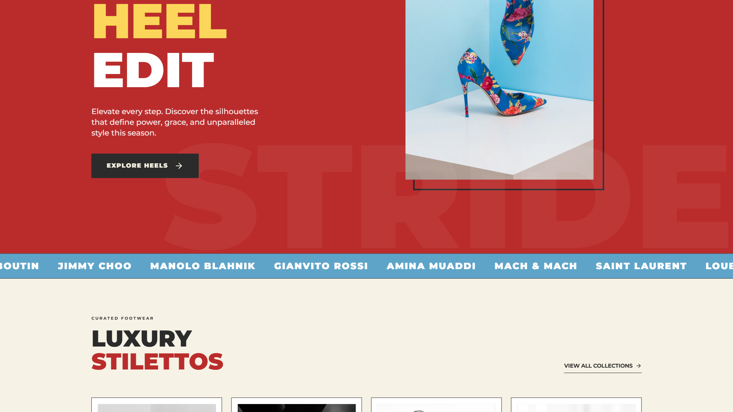
A high-impact 'Bold Retro-Modernism' design system characterized by a vibrant primary color palette (Retro Red, Vintage Blue, Sunny Yellow), heavy editorial typography, and brutalist-inspired layout elements. It features massive display text, offset borders, and a mix of grayscale and high-saturation imagery. This style is ideal for luxury fashion, high-end lifestyle brands, avant-garde editorial platforms, or design-focused e-commerce. It uses tight leading (line-height) and tracking (letter-spacing) to create a dense, authoritative aesthetic.
Summary
A striking, high-contrast editorial design system blending 1970s retro aesthetics with modern brutalist layouts, featuring bold primary colors and massive, tightly-spaced typography.
Style
The style relies on a rigid color palette: Retro Red (#BC2C2C), Vintage Blue (#5DA4C9), and Sunny Yellow (#FCD758), grounded by a Warm Beige (#F5F1E3) and a deep Charcoal Text (#2C2C2C). Typography is split between Montserrat for heavy, aggressive headlines (weights 700-900) and Open Sans for clean, functional body text. Key visual motifs include 12px-20px solid offset borders, infinite scrolling marquees, and grayscale-to-color image transitions.
Layout & Structure
The layout uses a block-heavy structure with high-contrast section changes. It alternates between full-bleed primary color backgrounds and neutral beige sections to maintain visual rhythm.
Navigation
Hero Section
Brand Ticker
Product Grid
Editorial Section
Footer
Components
Editorial Offset Card
A container with a faux-shadow created by a solid border-only div behind the main content.
Large Background Watermark Text
Hero-level text that creates texture without hindering readability.
Special Notes
MUST-DO: Use primary colors in their purest hex forms for maximum impact. MUST-DO: Ensure all typography uses tight leading (line-height < 1.0) for large headlines. MUST-NOT: Use rounded corners or soft drop shadows; all edges should be 90-degree angles and shadows should be solid color offsets. MUST-NOT: Use lowercase in labels or headings; reserve sentence case strictly for long-form paragraphs.