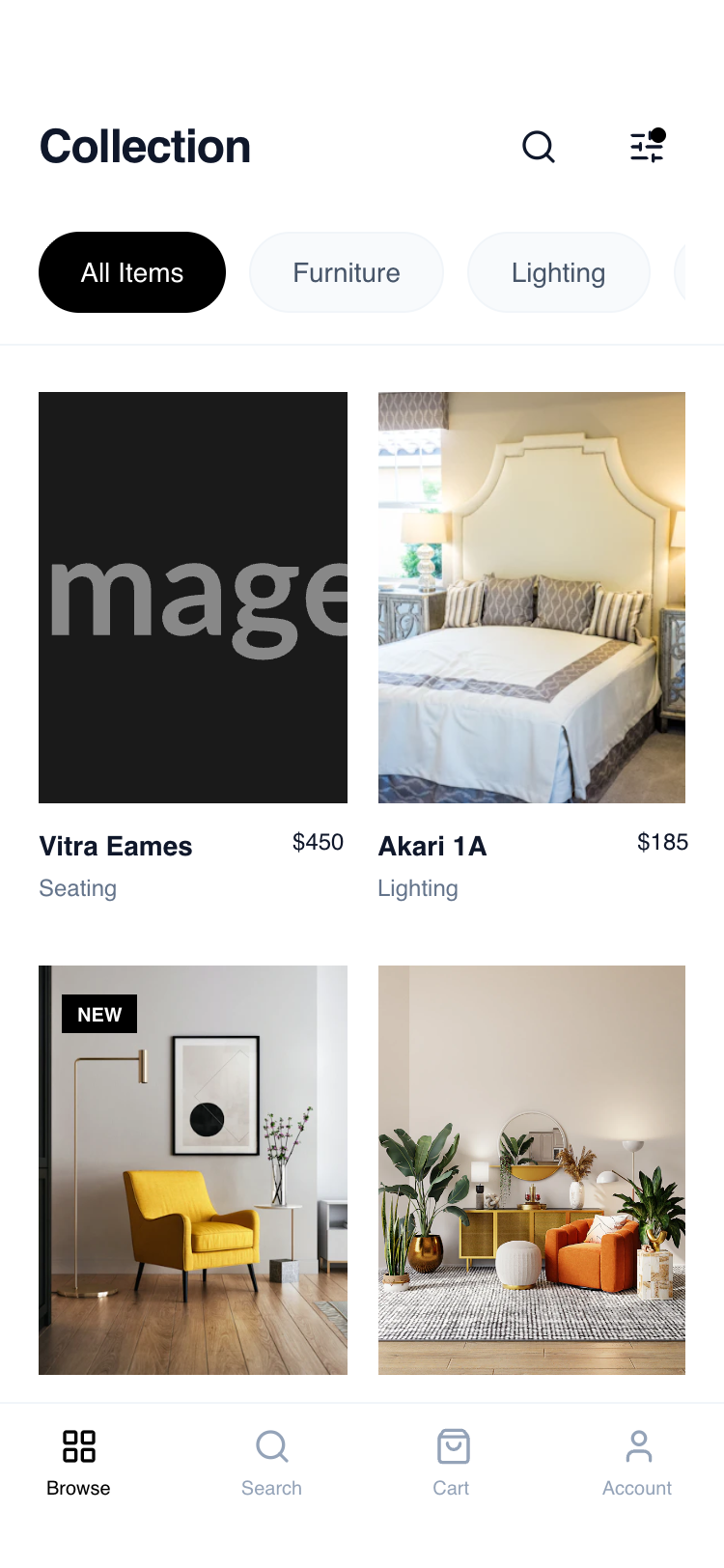
Card Grid Browse
A sophisticated, mobile-first product browsing layout emphasizing whitespace, clean typography, and a stable 2-column grid. The design utilizes a monochrome base with slate-toned neutrals to create a high-end 'boutique' feel, prioritizing product imagery and effortless navigation. Suitable for premium furniture, fashion, architecture, or design-focused platforms.
Summary
A sophisticated, mobile-first product browsing layout emphasizing whitespace, clean typography, and a stable 2-column grid. The design utilizes a monochrome base with slate-toned neutrals to create a high-end 'boutique' feel, prioritizing product imagery and effortless navigation.
Style
Minimalist editorial style using 'General Sans' for a modern feel. The palette is dominated by pure white (#FFFFFF), slate grays (#F1F5F9, #64748B, #0F172A), and sharp black accents. Animations are subtle, featuring 700ms image transitions and 95% scaling on active touch states. Borders are thin (1px) and used sparingly to define hierarchy without clutter.
Layout & Structure
A vertical-scrolling mobile layout composed of a sticky header, a scrollable category filter, a fixed-width grid, and a persistent bottom navigation bar.
Header and Category Bar
Product Grid
Bottom Navigation
Components
Interactive Filter Button
Action icon with a status indicator
Status Badges
Minimalist overlay labels on images
Special Notes
MUST: Maintain strict 3:4 aspect ratios for product images. MUST: Use 'General Sans' or a very clean geometric sans-serif to maintain the high-end feel. DO NOT: Use heavy drop shadows or rounded corners on images. DO NOT: Allow the header to obscure content without a backdrop-blur effect (bg-white/95 backdrop-blur-sm).