Check out Page- Express
Checkout layout that prioritizes express payment options at the top, followed by a fallback standard form. Optimized for returning users and reduced time-to-purchase. Best suited for High-return-customer brands, subscription products, digitally savvy audiences.
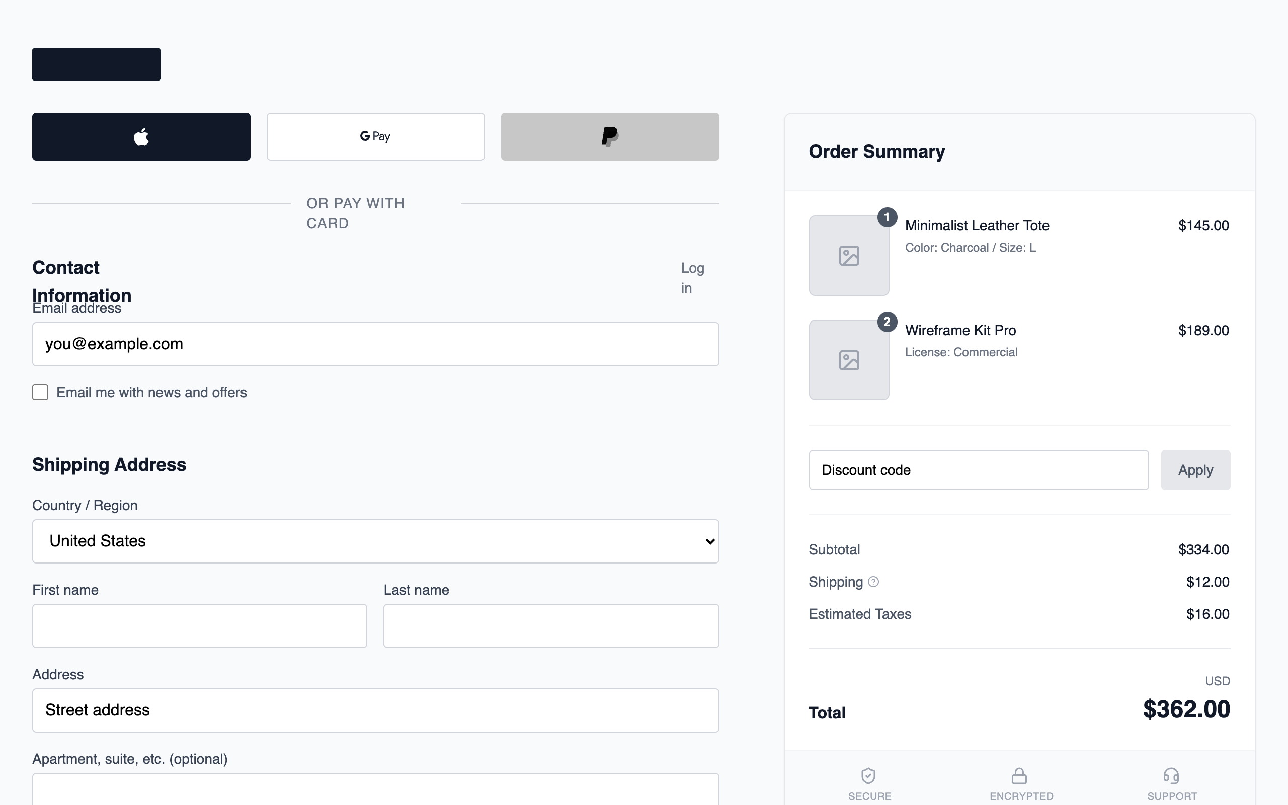
Summary
A sophisticated grayscale wireframe checkout interface featuring a 12-column responsive grid, sticky order summary, and standardized input systems focused on user efficiency.
Style
The style is minimalist and brutalist-lite, using the 'Switzer' font family for a modern, geometric look. The color palette is strictly grayscale, ranging from deep charcoal (#111827) to soft whites (#FFFFFF). UI elements use subtle borders (#D1D5DB), soft shadows, and clean hover states. Animations are restricted to smooth color transitions (150ms) to maintain a functional feel.
Layout & Structure
A responsive 12-column grid layout where the left column (7 cols) handles user input and the right column (5 cols) provides a sticky order summary. Mobile layout stacks the columns vertically.
Header
Express Payment Section
Form Sections
Payment Method Card
Sticky Order Summary
Components
Primary Pay Button
High-contrast payment button with integrated pricing information.
Product Badge Counter
Notification-style counter for order items.
Trust Footer
Security indicators for the checkout process.