Checkout Page- Standard Two Column
A balanced two-column checkout layout with the form flow on the left and a persistent order summary on the right. Maintains constant cost visibility while users complete required steps. Familiar, low-cognitive-load structure. Best suited for General eCommerce, DTC brands, multi-item carts, users already comfortable with online checkout.
Summary
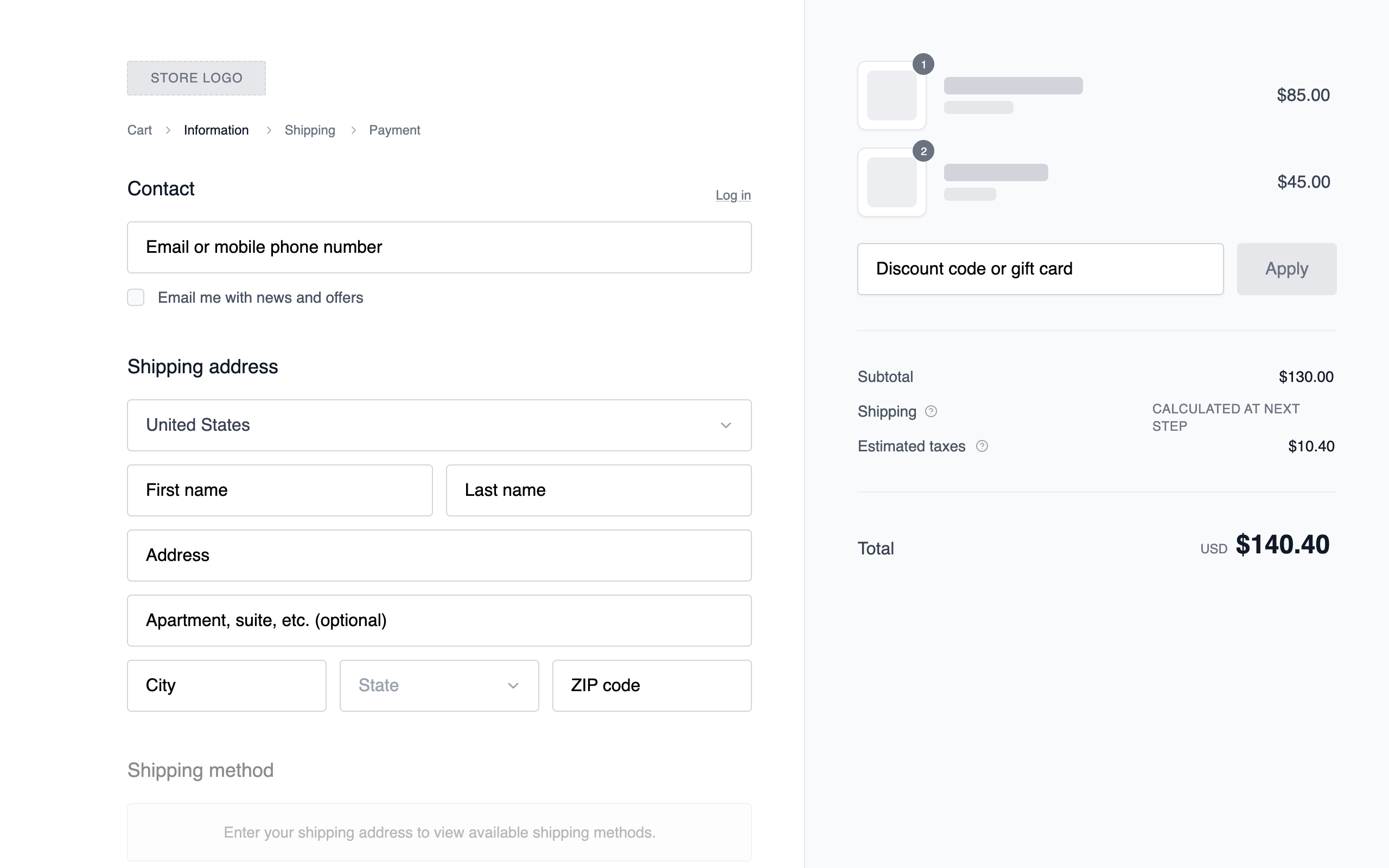
Create a professional grayscale e-commerce checkout interface using a 58/42 split-screen layout. Focus on high-contrast legibility, structured form fields, and a clear information hierarchy. The design should prioritize flow with a secondary sticky order summary column and a clean, sans-serif typographic system.
Style
The style is a 'clean wireframe' aesthetic using the 'Public Sans' typeface (weights 400, 500, 600). The color palette is strictly grayscale: White (#FFFFFF), Ghost White (#F9FAFB) for surfaces, Light Gray (#E5E7EB) for borders, and Jet Black (#111827) for primary actions. Transitions are subtle (150ms ease), and focus states use a soft ring effect (#9CA3AF).
Layout & Structure
A two-column responsive layout. On desktop, the left column (58% width) handles form entries (Contact, Shipping, Payment) and the right column (42% width) provides a sticky order summary with a light gray background. On mobile, the order summary moves to the top and is collapsible.
Header and Navigation
Contact and Shipping Sections
Payment Method Selector
Order Summary Sidebar
Footer Actions
Components
Product Image Placeholder
The thumbnail representation of cart items.
Progressive Disclosure Radio
Selection block for payment or shipping options.
Special Notes
MUST use a consistent 8px spacing unit. MUST NOT use any colors outside the #000000 to #FFFFFF range. MUST ensure all interactive elements (inputs, buttons) have a 150ms color transition. Form inputs MUST have a vertical height of exactly 48px. Section headings MUST be 18px Medium.