Classic Product Page
A standard two-column product layout with media on the left and purchase decision on the right. Emphasizes familiarity, clarity, and fast scanning. Uses accordions and a related-products row to keep the page compact but complete. Best suited for General DTC products, accessories, everyday consumer goods, brands prioritizing usability over storytelling.
Summary
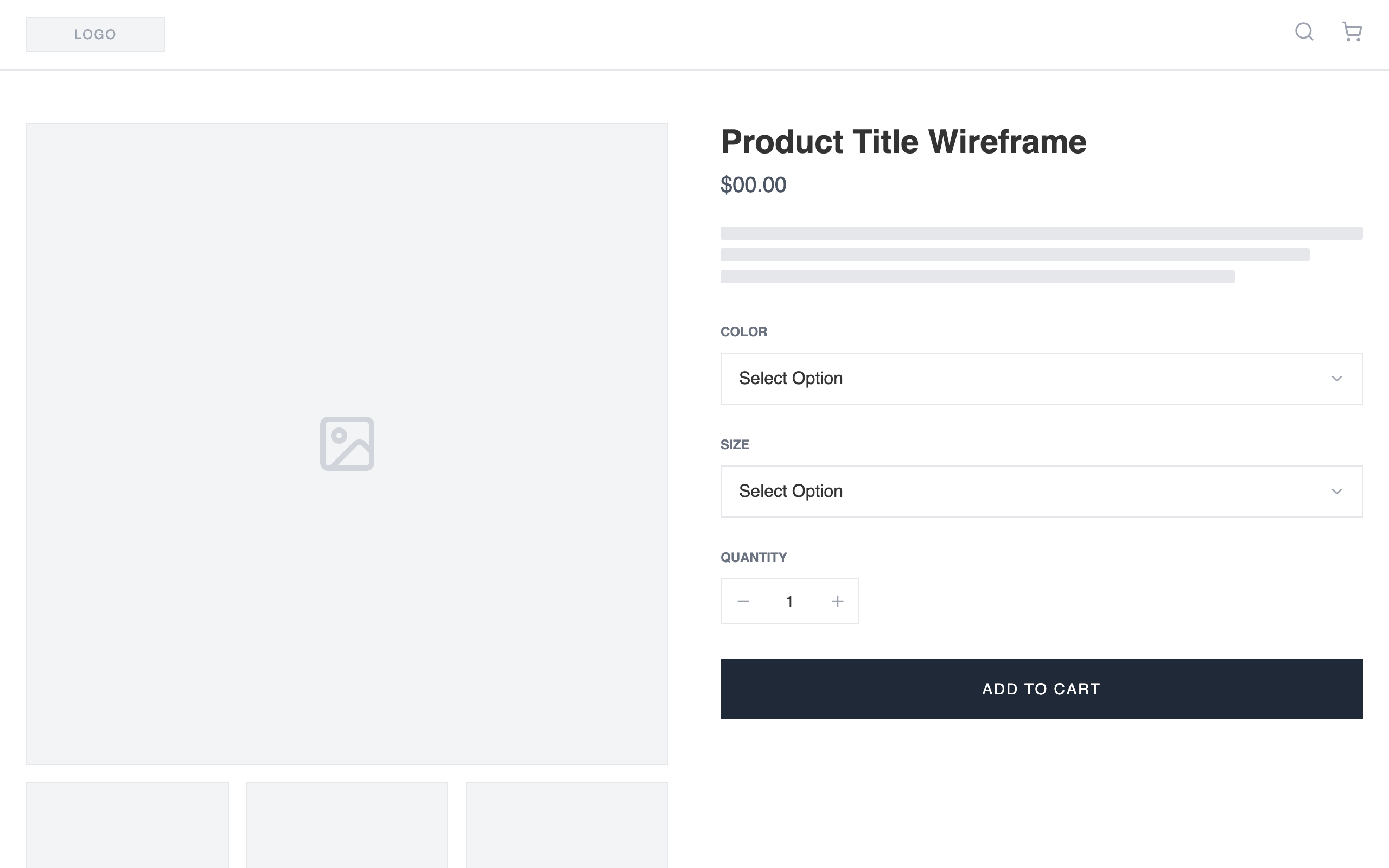
A clean, high-fidelity wireframe product detail page design using a monochrome palette. It features a large product image focus, structured meta-information, interactive variant selectors, and functional accordion details for logistical information.
Style
Typography: 'Public Sans' (weights 300, 400, 600). Palette: White (#ffffff), Light Gray (#f3f4f6), Border Gray (#e5e7eb), Dark Primary (#1f2937), and Soft Text (#333333). Aesthetic: Pure grayscale, no decorations, emphasis on spacing (gap-12, py-12) and 1px borders for structure.
Layout & Structure
The layout is a single-page responsive PDP starting with a thin utility header, moving into a 50/50 split product section, followed by full-width utility accordions and a related products grid.
Header
Product Media Section
Product Info Section
Accordions
Related Products
Components
Wireframe Text Block
Simulated text for layout purposes
Quantity Adjuster
Functional numeric input between +/- buttons
Special Notes
MUST maintain strict grayscale; do not use any colors outside of the specified hex codes. MUST use 'Public Sans' to maintain the clean, technical look. MUST ensure all placeholder icons (lucide:image, lucide:search, etc.) are consistently sized and colored #9ca3af.