Collection Page- Curated Collection Feed
A mixed-content collection layout combining product grids with editorial blocks. Products are grouped and introduced with context rather than shown all at once. Best suited for Lifestyle brands, premium collections, seasonal drops, brands selling a “set” or theme rather than individual SKUs.
Summary
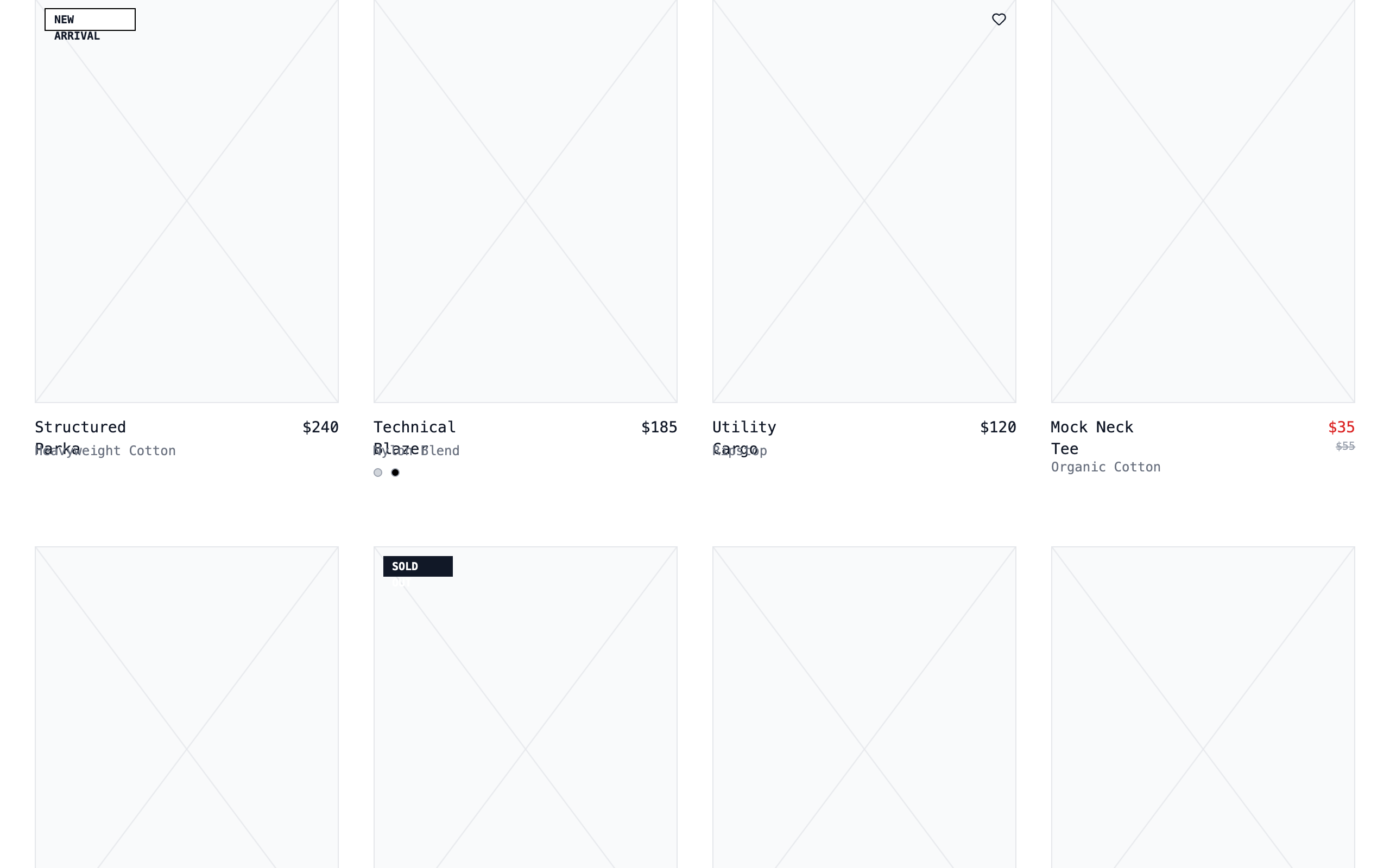
A sophisticated wireframe-inspired design system for e-commerce, utilizing 'JetBrains Mono' for a technical feel, a strict grayscale palette, and structural elements like diagonal placeholder crosses and 1px borders. It emphasizes content architecture over photography, perfect for avant-garde or technical brands.
Style
Technical minimalist theme using 'JetBrains Mono' (monospace) across all elements. The color palette is strictly monochrome (White #FFFFFF, Gray-200 #E5E7EB, Gray-500 #6B7280, Black #000000). Animation is subtle, focusing on opacity shifts and width-based transitions.
Layout & Structure
A clean, full-width container layout (max-width 1600px) with sticky navigation and filter bars. The content follows a modular grid that adapts from 2 columns on mobile to 4 columns on desktop.
Navigation
Hero Header
Sticky Filter Bar
Product Grid
Footer
Components
Wireframe Image Placeholder
A structural placeholder used instead of images to maintain the blueprint aesthetic.
Striped Progress Loader
An animated technical loading bar.
Size Quick-Add
A hover-triggered interaction for selecting sizes directly from the grid.