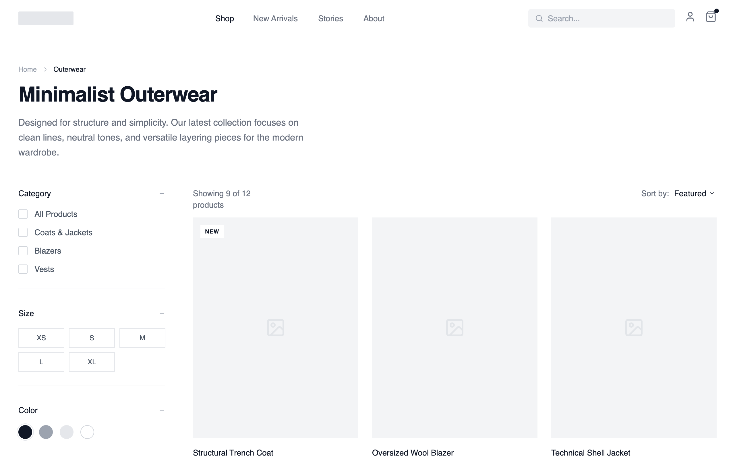
Collection Page- Filtered Product Grid
A utility-first collection layout with a persistent filter sidebar and a dense product grid. Designed for fast scanning, narrowing, and comparison. Prioritizes efficiency over storytelling. Best suited for Large catalogs, apparel, marketplaces, multi-SKU brands, products where users already know what they want.
Summary
A sophisticated monochrome wireframe design system for e-commerce, focusing on clean structure, neutral gray scales, and precise typography to showcase product collections without visual noise.
Style
The style is defined by a high-contrast grayscale palette and a 'General Sans' sans-serif typeface. It utilizes wide gutters, subtle borders (#E5E7EB), and micro-interactions like text-decoration transitions. The aesthetic prioritizes negative space and structural clarity over decorative elements.
Layout & Structure
A classic e-commerce collection layout with a sticky header, a wide sidebar for desktop filtering, and a flexible grid system that transitions from 1 column (mobile) to 3 columns (desktop).
Header
Collection Header
Sidebar Filters
Product Grid
Pagination
Components
Product Status Badge
Small informational labels positioned over product images.
Size Selector Grid
Interactive grid for quick size selection.
Special Notes
Must-do: Maintain exact 3:4 aspect ratio for all product image containers to preserve the editorial feel. Must-do: Use #F3F4F6 for all placeholder elements to distinguish from white background. Must-not: Use any shadows or rounded corners larger than 2px. Must-not: Use saturated colors; even the 'Color' filters should remain neutral unless specific brand colors are required.