Column Authentication
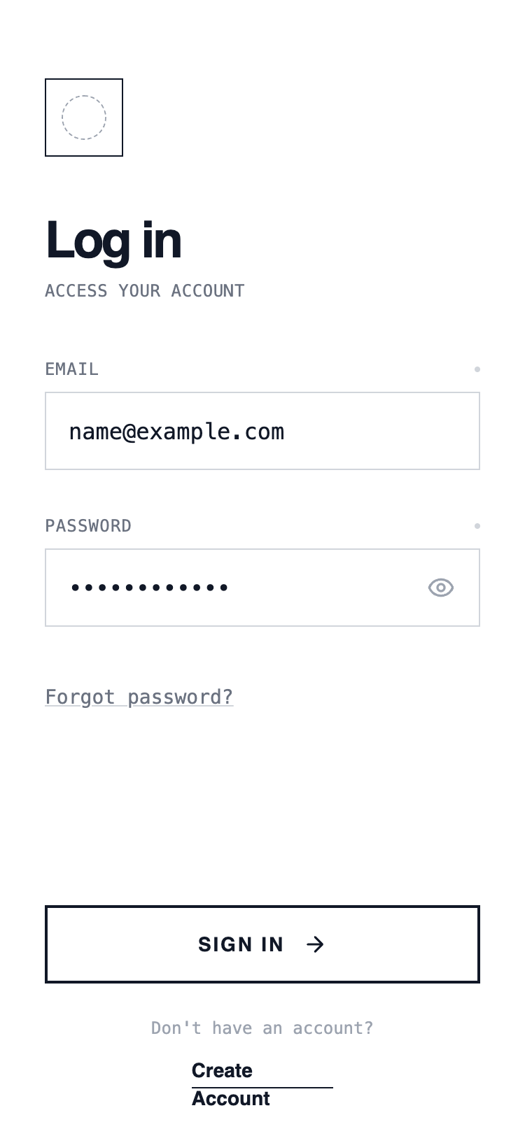
A classic single-column authentication layout with vertically stacked inputs and actions. Optimized for clarity and speed, this layout guides the user top-to-bottom with minimal cognitive load and works well for fast login scenarios.
Summary
A minimalist wireframe UI style utilizing a white background, sharp black borders, and high-contrast typography. It combines Satoshi for headlines with JetBrains Mono for utility text, creating a clean, technical, and structured user experience without shadows or rounded corners.
Style
The style is defined by a 'Draft' or 'Technical Blueprint' aesthetic. It uses a strict monochrome color palette (#FFFFFF, #111827, #6B7280). Typography uses Satoshi for bold headings and JetBrains Mono for metadata and inputs. All components feature rounded-none (0px) corners and 1px or 2px solid borders. Hover states focus on inversion and translation rather than depth.
Layout & Structure
A vertically stacked mobile-first layout with fixed 'Safe Area' headers and footers and a scrollable central content section.
Header
Main Content
Form Section
Footer
Components
Brutalist Primary Button
A high-contrast button that inverts on hover.
Status-Indicator Label
Technical label with focus state visualization.
Special Notes
DO: Use sharp 0px corners for all UI elements. DO: Use monospace for any utility text or labels. DO: Use high-contrast borders (2px) for primary buttons. DON'T: Use any box-shadows or drop-shadows. DON'T: Use color except for standard black/gray/white. DON'T: Use rounded corners on inputs or buttons.