Compact Control Grid
A dense arrangement of controls using grids and grouped sections. Prioritizes scanability and speed over storytelling. Best Suitable For Utilities, device controllers, system tools, internal apps.
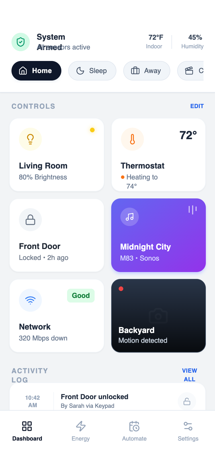
Summary
A sophisticated mobile-first design system optimized for high information density. It utilizes a 2-column modular grid for core controls, a horizontal 'scene' toggle strip for quick state changes, and a detailed activity log for historical data, all anchored by a clean, system-level status header.
Style
Modern high-density aesthetic using the 'Satoshi' font family for crisp readability. The palette is grounded in Slate neutrals (#F2F4F6 background, #1E293B text) with semantic colors for status: Emerald for active/safe (#10B981), Orange for heating/warning (#F97316), and Yellow for lights (#FACC15). Elements use a consistent 16px (2xl) border radius, subtle 1px borders, and micro-interactions like 0.98x scale-down on press.
Layout & Structure
A vertically stacked mobile layout consisting of a fixed-width container with three primary zones: a system status header, a scrollable main dashboard, and a bottom navigation bar.
Header & Status Strip
Control Grid
Activity Log
Navigation Bar
Components
Media Control Card
Vibrant gradient card with a mini-visualizer.
Live Camera Card
Dark-themed card with live recording indicator.
Special Notes
MUST: Maintain tight spacing (12px gap in grids) to achieve 'dense' feel. MUST: Use high-contrast between headers and subtext (Bold 14px vs Medium 10px). DO NOT: Use standard 16px body text as it breaks the information density. MUST: Include a scale-down effect on every clickable modular card for tactile feedback.