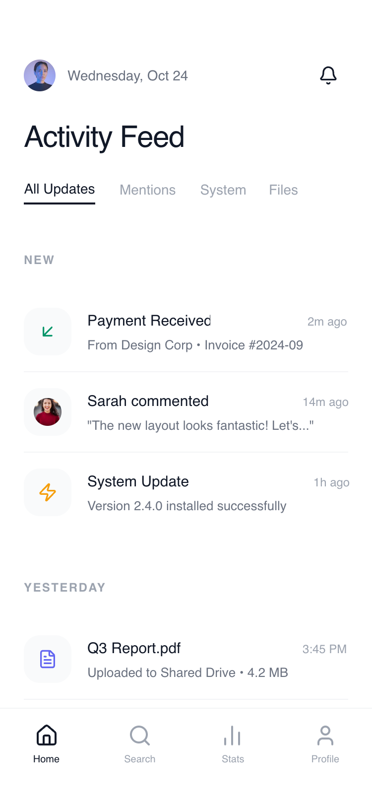
Composable Feed Home
A streamlined, ultra-minimalist feed-based layout designed for high-density information with maximum readability. Features a white-on-white aesthetic with subtle dividers, sticky section headers, and generous negative space. Optimized for SaaS activity streams, fintech transaction logs, notification centers, and productivity dashboards. Key stylistic elements include the use of the 'Satoshi' font, a grayscale primary palette with vibrant functional icon accents, and blurred sticky elements.
Summary
A modern, feed-centric UI that prioritizes vertical rhythm and clean typography over boxed card layouts. It uses a hierarchy of primary text, metadata, and leading visual markers to facilitate rapid scanning of information.
Style
The style is defined by its 'Clean Utility' aesthetic. It uses a high-contrast palette of white (#FFFFFF) and rich black (#0F0F0F) for text, paired with neutral grays (Gray-50, 100, 400, 500) for UI elements. Typography utilizes 'Satoshi' and 'General Sans' for a balanced, modern feel. Micro-interactions include subtle background shifts on hover and smooth scrolling with sticky header transitions.
Layout & Structure
The layout follows a strict vertical flow with a fixed top header and a floating/sticky bottom navigation. Content is categorized into sections marked by uppercase sticky headers.
Header Section
Main Feed Stream
Feed Item Block
Bottom Navigation
Components
Leading Icon Container
Functional square with soft corners for activity identifiers.
Segmented Filter Bar
Zero-border horizontal scroll navigation.
Special Notes
MUST: Maintain at least 24px of horizontal padding throughout. MUST: Use sticky headers for temporal categories (e.g., 'Today', 'Yesterday'). MUST: Use 48px icons as visual anchors. DO NOT: Use heavy shadows or colored borders. DO NOT: Use 'cards' with borders; use background shifts and dividers instead.