Conversion-optimised Product Page
Traditional PDP enhanced with a sticky purchase module that remains visible during scroll. Reinforces CTAs with social proof and benefit blocks to reduce hesitation. Best suited for High-volume DTC brands, ads-driven traffic, products optimized for CRO.
Summary
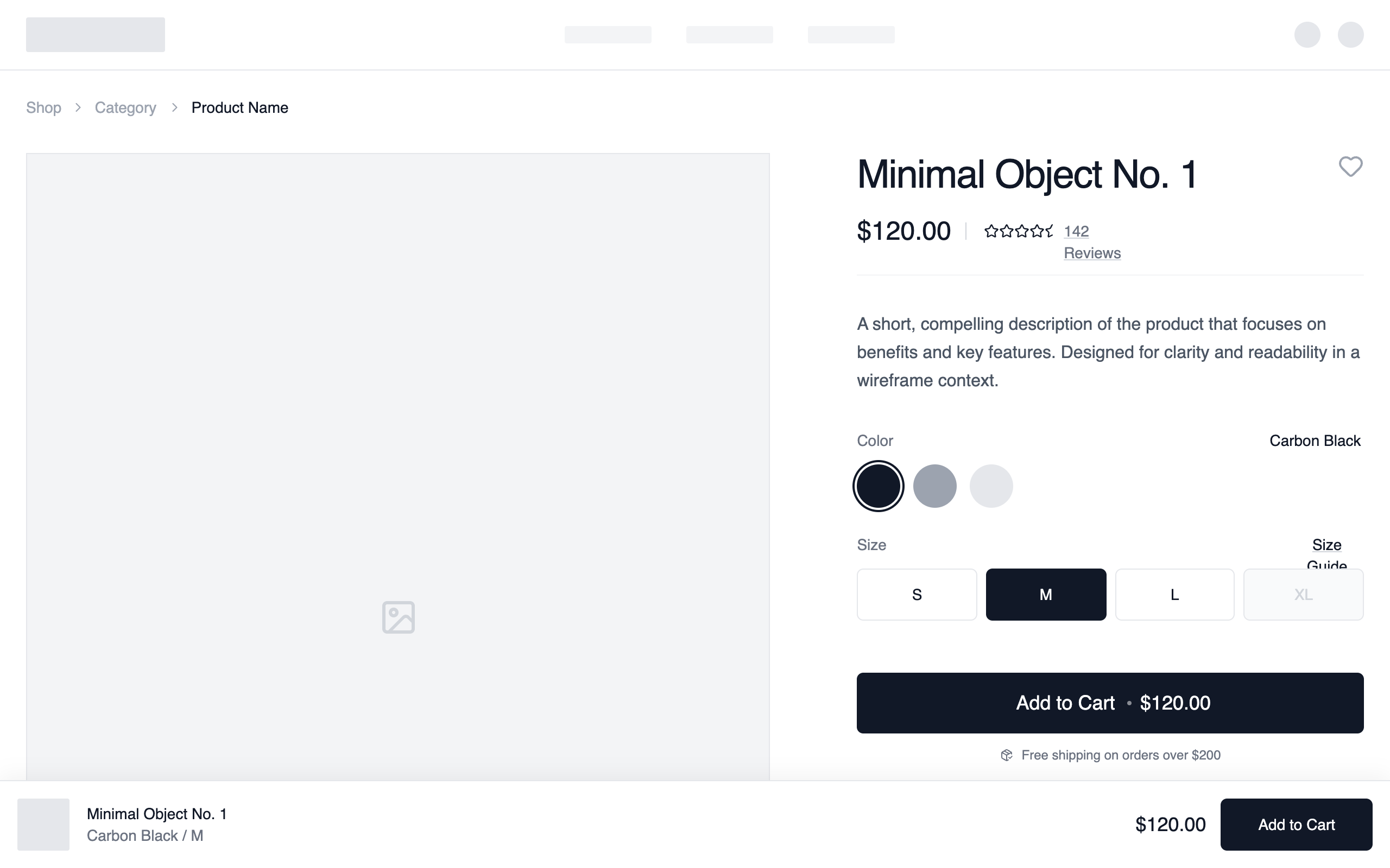
A clean, monochrome e-commerce product layout focused on clarity and conversion. It employs a two-column structure (7:12 ratio) for primary product content, detailed variant selectors, and a floating sticky purchase bar for mobile and desktop visibility.
Style
The design uses a strictly monochrome palette (#FFFFFF, #F5F5F5, #111827) and 'General Sans' typography to create a high-end, editorial feel. It emphasizes clean lines via 1px borders (#E5E7EB) and subtle micro-interactions like 500ms image zooms and ring-offset focus states for interactive elements. Layout follows a strict 1440px grid with variable padding based on screen size (24px to 80px).
Layout & Structure
A top-down flow starting with a functional header, moving into a 2-column product detail section (Gallery 60% / Info 40%), followed by trust-building horizontal strips (Social Proof/Benefits) and ending with a 4-column related products grid.
Navigation & Breadcrumbs
Product Main Section
Social Proof and Benefits
Related Products Carousel
Components
Sticky Conversion Bar
A fixed bottom bar that captures attention for conversion.
Minimalist Variant Selector
A clean grid for size selection with interactive states.
Special Notes
MUST maintain strict monochrome color usage; do not introduce accent colors other than black/white/gray. MUST use 4:5 and 3:4 aspect ratios for all product imagery to maintain an editorial vertical feel. MUST ensure the sticky purchase bar only appears after the user scrolls past the primary 'Add to Cart' button. DO NOT use heavy drop shadows; use 1px borders for depth instead.