Cubemotel | Sustainable Modular Holidays (Green & Gold Palette)
A high-end sustainable hospitality design system featuring a green and gold palette, editorial typography, and modular layout structures. Optimized for eco-friendly luxury, modular architecture, and premium travel industries. Key elements include a blend of Helvetica Neue and Playfair Display fonts, glassmorphism navigation, bento-grid product displays, and 'The Bridge' conceptual feature comparison. Technical highlights: CSS-based 'cube-border' decorative corners, orange-glow shadows, and subtle leaf-inspired iconography.
Summary
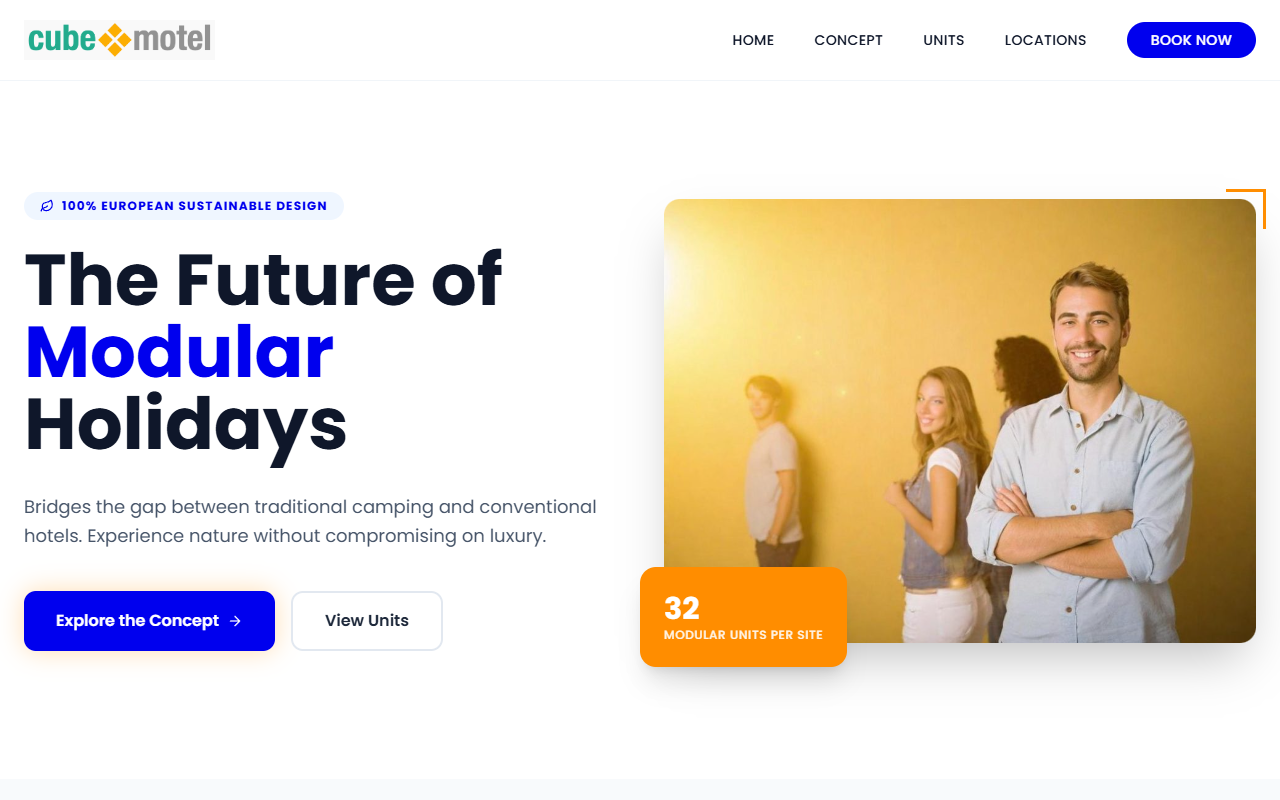
A modern, sustainable brand aesthetic that bridges the gap between raw nature and high-end luxury through a primary green (#00AB8E) and secondary orange-gold (#F0B13D) color scheme. The design uses architectural framing, floating UI badges, and editorial serif accents to establish authority and ecological commitment.
Style
The style is 'Eco-Premium Minimalism'. It utilizes a sophisticated primary green (#00AB8E) for brand identity, a gold/orange accent (#F0B13D) for premium CTAs and highlights, and a neutral grey (#929292) for structural elements and secondary text. Typography pairs the functional Helvetica Neue (Sans-serif) with the elegant Playfair Display (Serif) for headings. Visuals are defined by high-contrast shadows, subtle blur effects (backdrop-filter), and geometric 'cube' accents.
Layout & Structure
The layout follows a modular grid system with asymmetrical hero sections, conceptual horizontal connectors, and tiered card-based product showcases. It emphasizes white space and clean vertical flow.
Navigation Bar
Hero Section
The Bridge (Feature Comparison)
Tiered Product Grid
Dark Expansion Section
Components
Status Badge
Floating pill labels for product tiers.
The Bridge Connector
A visual separator used to show hybrid concepts.
Interactive Cube Card
Service or unit cards with specific hover behaviors.