Cute Timer App - Natural Growth Palette
A warm, natural, and growth-focused design system featuring an organic palette of Spring Green, Sky Blue, and Warm Tan. Optimized for wellness, productivity, and mindfulness apps, it utilizes a sophisticated combination of Cabinet Grotesk for bold display typography and Satoshi for clean body text. Key features include a haptic-centered UX, circular progress indicators with lush gradients, soft-edged cards with subtle elevation, and playful micro-interactions like confetti celebrations and rhythmic pulsing. The aesthetic balances a minimalist white-space heavy layout with rich, earthy accents, making it suitable for habit trackers, focus timers, and health-tech platforms.
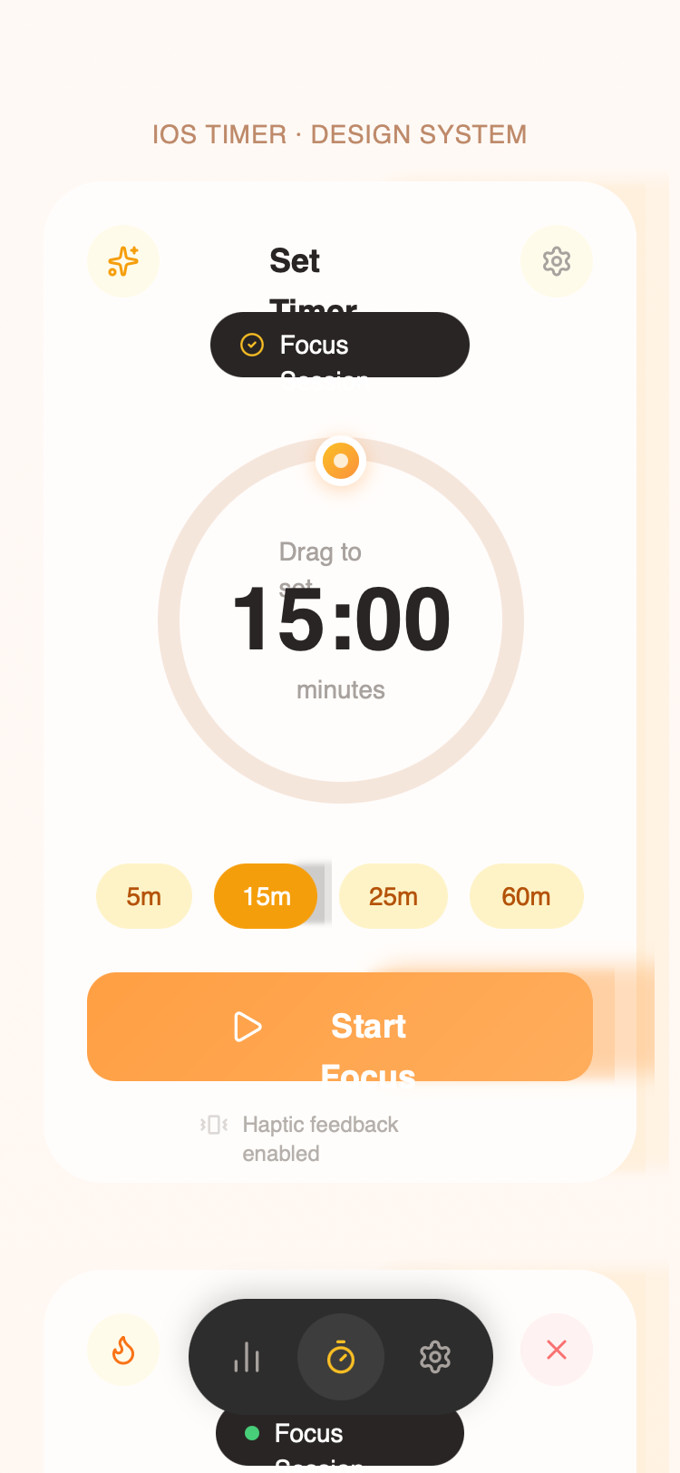
Summary
A friendly and tactile mobile-first UI focused on focus and growth. It uses high-contrast earthy tones against soft white backgrounds to create a sense of calm productivity. The design is characterized by large, playful buttons, circular geometry, and haptic-inspired feedback cycles.
Style
The style is 'Organic Productivity'. It combines a soft background (#F5F5F5 to #FAF7F4 gradient) with a primary 'Growth' color of Spring Green (#7CB342). Typography uses Cabinet Grotesk (Extrabold) for high-impact numbers and Satoshi (Medium/Bold) for readability. Interactions are bouncy and spring-based, using scale-downs on click and soft glows on active states.
Layout & Structure
The layout is centered around a primary interactive focus card within a full-bleed soft background. Elements are vertically stacked with high internal padding (24px) to emphasize touch-friendly interaction.
Header Navigation
Main Timer Card
Action Controls
Preset Selection
Bottom Navigation
Components
Interactive SVG Timer Ring
A customizable progress ring with a draggable handle.
Celebration Particles
Confetti system for completion states.
Haptic Pulse Indicator
Small status label with a rhythmic pulse animation.