Dark Avant-Garde Style
A dark avant-garde design system termed 'Digital Naturalism,' characterized by a sophisticated interplay between deep charcoal surfaces and high-energy acid green accents. Featuring editorial serif typography paired with clean sans-serif UI, the style utilizes Brutalist-inspired elements like serrated edges, skewed 'tab' navigation, and grainy noise overlays. Ideal for high-end design agencies, AI masterclasses, editorial portfolios, and premium fintech brands seeking a bold, technical, yet organic aesthetic.
Summary
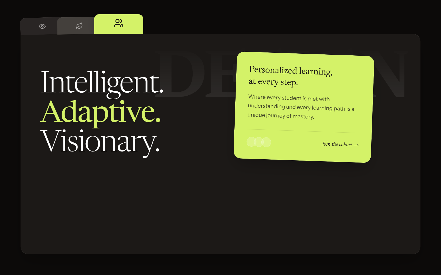
A high-contrast dark-mode design system with an editorial feel, using vibrant lime accents, sophisticated serif headings, and unique geometric cut-outs to create a premium, technical atmosphere.
Style
The style blends 'Digital Naturalism' with brutalist technicality. It uses a core palette of deep charcoal (#0C0A09), warm stone (#E7E5E4), and a signature lime accent (#D4F268). Typography is a dual-system: 'Newsreader' for elegant, light-weight serif headings and 'Instrument Sans' for functional UI and body text. Visuals are treated with a fixed 4% opacity noise overlay to provide texture and organic 'analog' feel to the digital surfaces.
Layout & Structure
A structured yet dynamic layout featuring a fixed glassmorphism navigation bar, asymmetrical hero sections, and a signature 'bento-tab' layout for content sections.
Navigation
Hero Section
Tabbed Main Content
Showcase Grid
Components
Serrated Edge Divider
A procedural jagged edge used to divide dark sections.
Sticky Note CTA
A highlight card that mimics a physical note pinned to the interface.
Catalog Label
Technical metadata label for images.
Special Notes
MUST use the noise overlay to prevent the dark colors from appearing flat. MUST NOT use standard pure black (#000000); use the stone-tinted #0C0A09. Headlines MUST use light weights (300 or lower) to maintain the 'Avant-Garde' editorial aesthetic. Icons should be monochrome Lucide-style line icons.