Data Visualization Dashboard
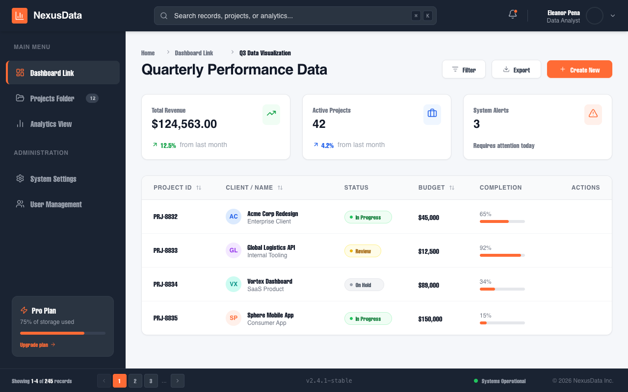
A professional enterprise-grade data visualization dashboard featuring a high-contrast dark navy and vibrant orange color palette. The design uses a structured 3-part layout (Header, Sidebar, Main Content) optimized for SaaS platforms, fintech, analytics tools, and project management systems. It emphasizes clarity through a clean Plus Jakarta Sans typography, modular bento-style metric cards, and a sophisticated data table with contextual hover actions and status indicators.
Summary
A clean, high-performance data dashboard using a professional navy and orange color scheme, featuring a fixed sidebar, global search with keyboard shortcuts, and interactive data tables with status badges.
Style
The design follows a modern 'Enterprise Dark' aesthetic where deep navy (#1a2332) provides the structural framework, contrasted against a clean light-gray (#f5f7fa) workspace. The primary accent is a vibrant orange (#ff6b35) used for call-to-actions, active states, and progress indicators. Typography is handled by 'Plus Jakarta Sans' with weights ranging from 400 (regular) for body to 700+ for headers to ensure clear information hierarchy. Micro-interactions include smooth background color transitions on hover, shadow-based depth for buttons, and a pulsing status indicator for real-time connectivity.
Layout & Structure
The layout is a fixed-header, fixed-sidebar structure with a scrollable main content area. A secondary footer status bar provides contextual metadata and pagination.
Header Section
Navigation Sidebar
Main Content Header
Metric Overview Cards
Data Visualization Table
Footer Status Bar
Components
Status Pill Badges
Rounded status indicators with semantic coloring.
Mini Progress Trackers
Visual completion indicators inside table cells.
Special Notes
MUST maintain the 4px vertical border-left indicator for active sidebar items. MUST ensure table action buttons are hidden (opacity: 0) until the parent row is hovered. MUST use a 75% opacity overlay for modal/dropdown backdrops. DO NOT use generic blue for primary actions; strictly adhere to #ff6b35 orange for all primary interactive elements to maintain brand identity.