Disruptor Beta Launch
A high-impact Neo-Brutalist design system designed for product launches and disruptive SaaS platforms. Characterized by stark color contrasts, industrial typography, and heavy geometric borders. The aesthetic utilizes a dark mode base (#121212) punctuated by vibrant 'Volt' accents (#CCFF00) and crisp white containers. Key features include 'sticker-style' rotated elements, massive display type, solid 8px offsets (Neo-shadows), and vertical navigation elements. Ideal for high-growth tech, developer tools, fintech, and creative agencies looking for an aggressive, authoritative, and innovative brand presence.
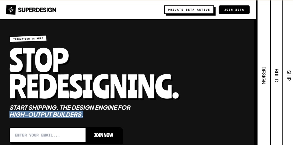
Summary
The 'Disruptor' style guide is a bold, industrial-themed framework that merges brutalist architecture with modern UI components, emphasizing speed, technical precision, and high-output shipping.
Style
The style is built on a foundation of 'Ranchers' for massive, attention-grabbing headlines, 'Space Mono' for technical labels and industrial data, and 'Plus Jakarta Sans' for legible body copy. The color palette is strictly limited to Black (#000000), Dark Grey (#121212), White (#FFFFFF), and a signature Volt green (#CCFF00). It avoids gradients and soft shadows in favor of hard 4px/8px borders and solid offset shadows (neo-shadows). Layouts are structured using thick black lines and high-contrast section transitions.
Layout & Structure
The layout features a main content area with a fixed, multi-layered vertical sidebar on large screens, creating a 'blueprint' or 'industrial' feeling. Sections are separated by heavy 8px black horizontal borders.
Header Navigation
Hero Section
Social Proof Sticker Bar
High-Impact Comparison Section
Process Blueprint
Structural Sidebar
Components
Brutalist Countdown Timer
A series of high-contrast boxes displaying time units.
Integrated Waitlist Form
A high-precision input and button combination.
Special Notes
MUST: Use only solid shadows (no blur/spread). MUST: Use all-caps for technical labels and headlines. MUST: Use heavy borders (minimum 4px). MUST: Maintain high contrast between black/white and black/volt. DO NOT: Use rounded corners larger than 8px. DO NOT: Use gradients or transparency except for the background watermarks. DO NOT: Use 'soft' UI elements like pastels or blurred glass effects.