Editorial onboarding
A sophisticated, editorial-style onboarding experience for creative SaaS or workspace platforms. It features a muted earth-tone palette, a tactile noise grain texture, and high-end typographic pairing. The design utilizes huge display type, organic ambient background animations, and an intentional use of white space to create a premium, mindful user journey. Key features include a fixed 'Echo Panel' for live state updates, masonry card layouts with subtle rotations, and custom interactive dials for user input. It is optimized for creative agencies, architecture portfolios, fintech, or productivity tools aiming for an 'elevated' brand feel.
Summary
An editorial onboarding flow with a warm minimalist aesthetic, featuring huge typography, a noise-textured background with organic floating blobs, and high-precision interactive UI components.
Style
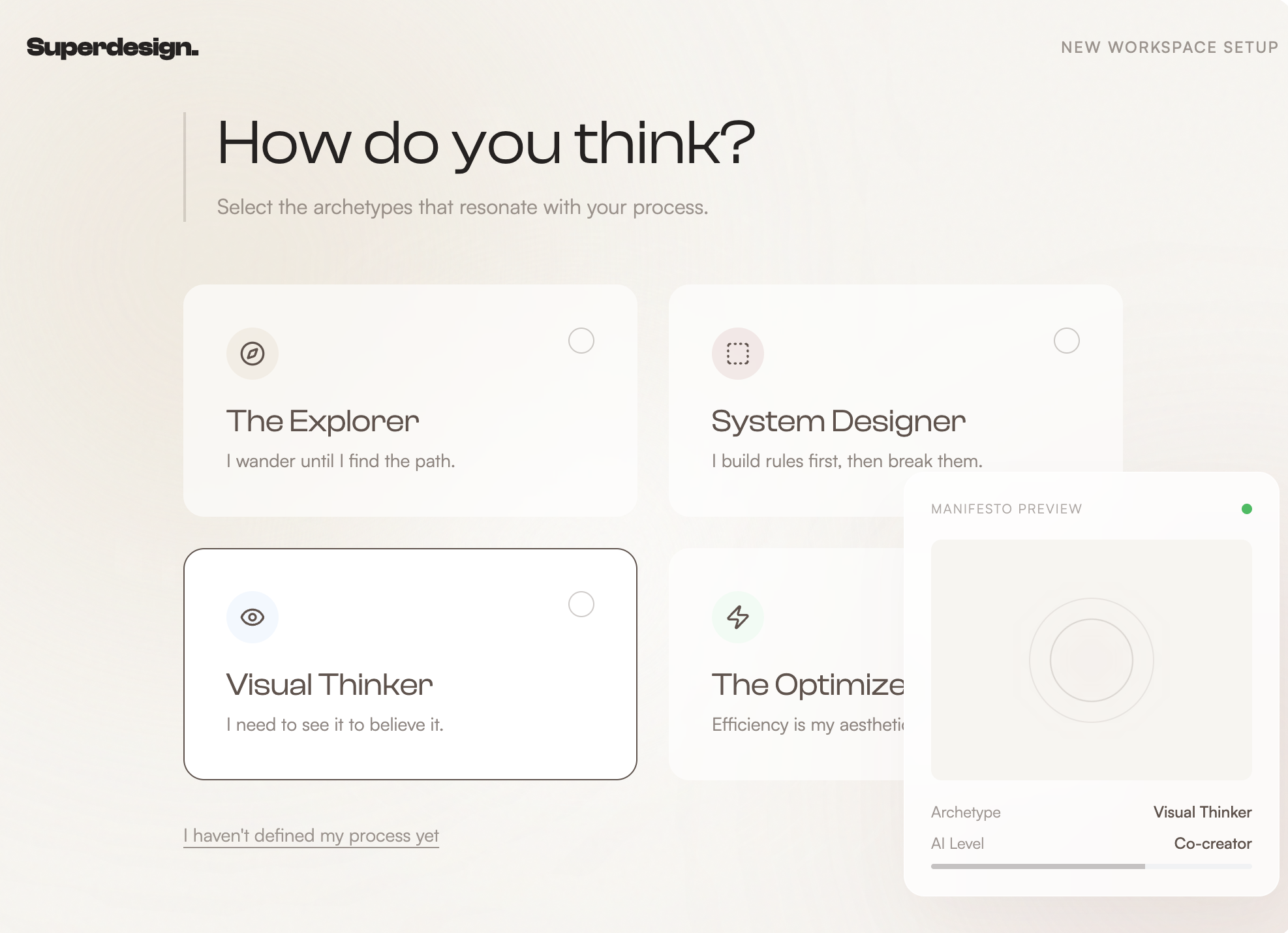
The style is 'Warm Minimalist Editorial.' It uses Clash Display (Variable) for high-impact headings and Satoshi for legible, wide-spaced body text. The color palette is centered on neutrals: Cream (#F8F6F3), Deep Taupe (#6B5D56), and Charcoal (#2A2624), with Muted Rose (#D4A5A5) as a soft accent. Key stylistic traits include a 5% opacity noise overlay, ambient blurred background circles that drift slowly, and a 1.2s cubic-bezier entrance animation for content elements.
Layout & Structure
The layout follows a centered, single-column scroll-based journey with a max-width of 768px (3xl). Sections are separated by massive vertical gaps (128px to 192px) to ensure focus on individual steps. A persistent floating panel on the right side provides real-time feedback.
Header/Navigation
Floating Echo Panel
Hero Section
Archetype Grid
Success Masonry
Orbital Control Dial
Completion Moment
Components
Interactive Archetype Card
A sophisticated checkbox replacement card that uses peer-state styling.
Noise Overlay
A global texture that gives the design a tactile, paper-like feel.