Editorial SaaS Onboarding
An editorial SaaS onboarding experience featuring a calm, sophisticated aesthetic. It uses a muted warm stone palette with terracotta accents, high-contrast serif headlines (Crimson Pro) paired with clean sans-serif UI text (Inter). The layout follows a natural document flow within a product shell, avoiding scroll-locks or overlays. Suitable for premium B2B SaaS, design tools, publishing platforms, and luxury fintech applications that prioritize a confident, professional, and non-intrusive user experience.
Summary
A sophisticated, scroll-based SaaS onboarding page embedded in a professional product shell. The design emphasizes an editorial feel through elegant typography, a warm neutral color palette, and high-quality whitespace management.
Style
The style is 'Editorial Minimalist'—combining the structure of a modern application with the readability of a high-end magazine. It utilizes a warm neutral palette (Stone/Beige) instead of pure grays to create a 'calm' atmosphere. Key features include serif headings for a literary feel, tactile borders (1px) over drop shadows, and a muted terracotta accent for focus.
Layout & Structure
A classic dashboard layout with a fixed sidebar and header, where the central onboarding content is a long, naturally scrollable column focused on a single-column container.
Product Shell
Onboarding Hero
Selection Grid
Editorial Explanation
Interface Preview
Personalization & CTA
Components
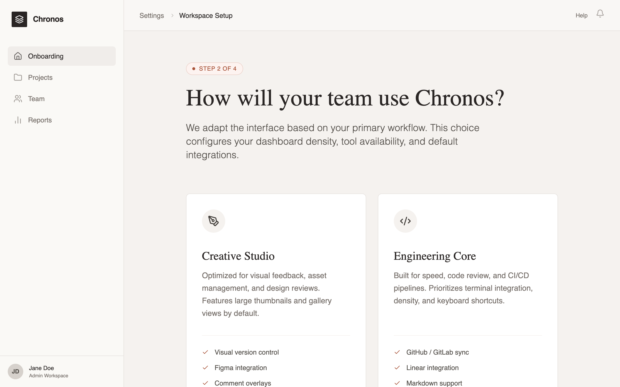
Interactive Mode Card
Tall, vertically oriented cards used for primary selection.
Density Toggle
A segmented control for UI density selection.
Special Notes
Must maintain a calm, quiet aesthetic; never use exclamation marks or 'hype' sales language. Ensure the page length is significant enough to require scrolling (min-height: 100vh). Use icons from a consistent thin-line set (like Lucide). Use natural document flow—do not hide content behind tabs if they can be scrolled through.