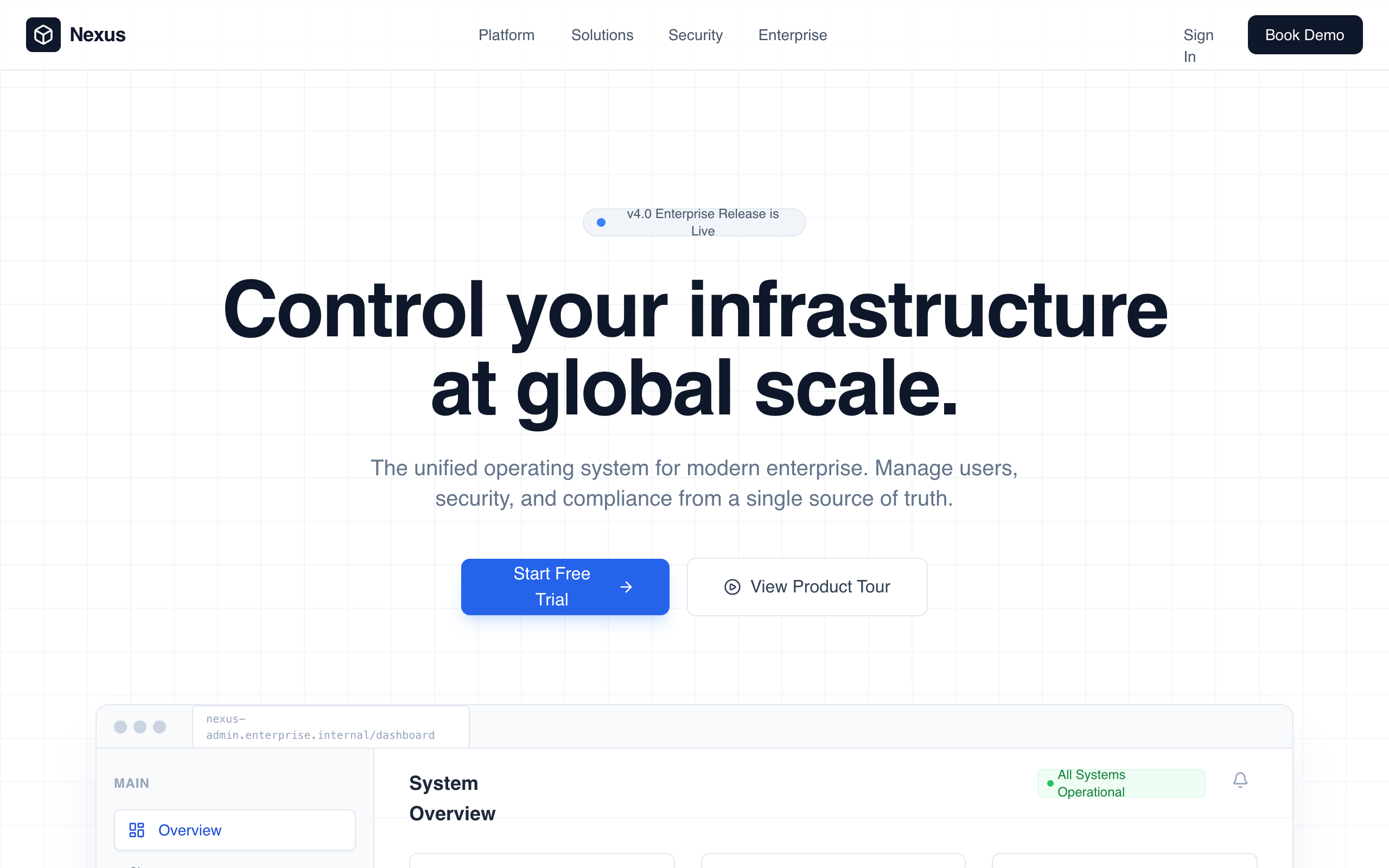
Enterprise Admin Platform
Enterprise Admin Platform is a professional, high-trust landing page design for corporate B2B SaaS, fintech, and infrastructure tools. It features a muted corporate color palette (whites, deep slates, and technical blues), a structured grid-based layout, and a focus on operational control and security. Key elements include a high-fidelity dashboard preview, KPI count-up animations, and a glass-morphism navigation bar. Suitable for enterprise management systems, cybersecurity platforms, and developer infrastructure tools.
Summary
A clean, authoritative enterprise admin landing page using a strict grid layout, technical typography (Satoshi), and a professional color scheme of slate and primary blue. Features include a dashboard UI preview, audit log tables, and security policy management components, all enhanced by subtle fadeInUp animations and glass-morphism effects.
Style
The style is 'Corporate Professional' with a focus on legibility and scale. It uses the Satoshi font family (weights 400-900) for a neutral but modern feel. The palette relies on Slate 950 (#020617) for dark backgrounds and Blue 600 (#2563eb) for actions. Micro-interactions include 0.8s ease-out fades, 12px backdrop blurs for nav panels, and scale transitions on feature cards. Borders are subtle (#e2e8f0) and layout follows a 40px grid system.
Layout & Structure
The layout follows a predictable, top-down enterprise narrative: Navigation -> Hero with Product Visual -> Social Proof -> Core Modules -> Quantifiable Impact (Stats) -> Security Proof -> FAQ -> CTA -> Detailed Footer.
Navigation
Hero Section
Dashboard Preview
Module Grid
Stats Section
Security UI Section
Enterprise Footer
Components
KPI Count-up
Animated numbers that count from zero to the target value when entering the viewport.
Audit Log Table
High-density information table with status badges.
Glass-Morphism Toggle
Operational switch used for security policy simulations.
Special Notes
MUST: Maintain a strict vertical rhythm with 128px spacing between major sections. MUST: Use only grayscale and primary blue for main UI, reserving colors like green/red strictly for status indicators. MUST NOT: Use rounded corners larger than 12px for structural elements. MUST NOT: Use heavy gradients; keep all surfaces flat or slightly glass-morphic.