EPOCH | Editorial System 1.0
EPOCH is a brutalist editorial design system characterized by high-contrast typography, a monochromatic void background with 'acid' lime accents, and a technical, low-latency aesthetic. It blends luxury editorial layouts (Fraunces serif) with cyberpunk technical metadata (Inter sans). Key features include grain textures, scanline overlays, CRT-style animations, and high-friction interactions. Best suited for high-end SaaS, creative agencies, technical portfolios, fintech, and edgy lifestyle brands.
Summary
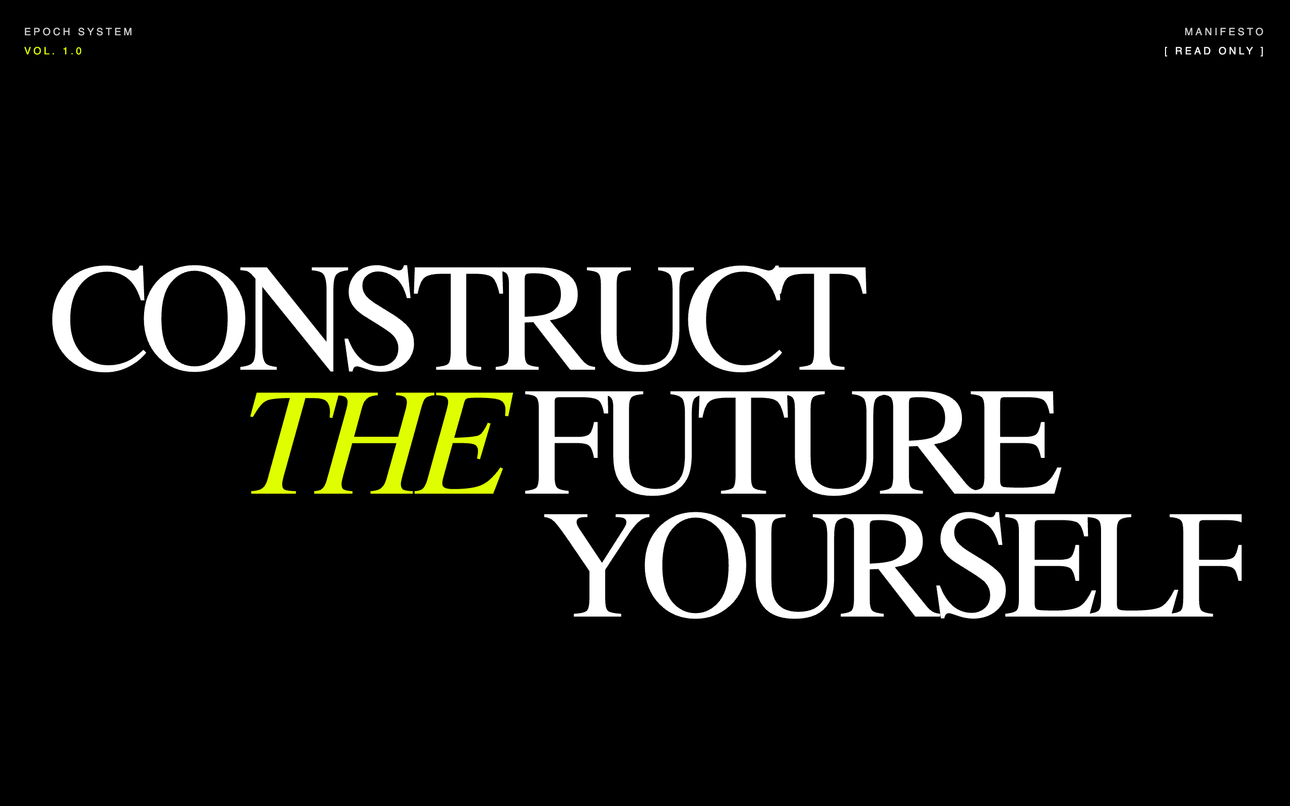
A dark-mode editorial system that treats software as a physical tool, featuring massive serif headlines, technical metadata annotations, a gritty grain overlay, and a striking '#DFFF00' acid accent.
Style
The style is 'Brutalist Editorial.' It utilizes a strict color palette: Void (#000000), Paper (#FFFFFF), and Acid (#DFFF00). Typography pairings focus on high-contrast extremes: a bold, variable serif (Fraunces) with tight tracking for headlines, and a clean sans (Inter) with ultra-wide tracking (0.3em) for technical labels. Visual effects include a persistent 5% opacity noise/grain overlay, a grid background (40px cells), and scanline animations to mimic high-performance interfaces.
Layout & Structure
A vertical-scrolling editorial layout featuring massive typographic hero blocks, sticky utility bars, and a high-contrast inverted section for core values.
Navigation & Metadata
Hero Section
Sticky Status Bar
Editorial Manifesto
System Specs Grid
Inverted Creed Section
Footer & Call to Action
Components
Reveal Wrapper
A container that masks content and reveals it with a smooth upward slide.
Scanline Overlay
CRT-style vertical light bar that scans the screen.
Acid Button
Aggressive, high-contrast action button.