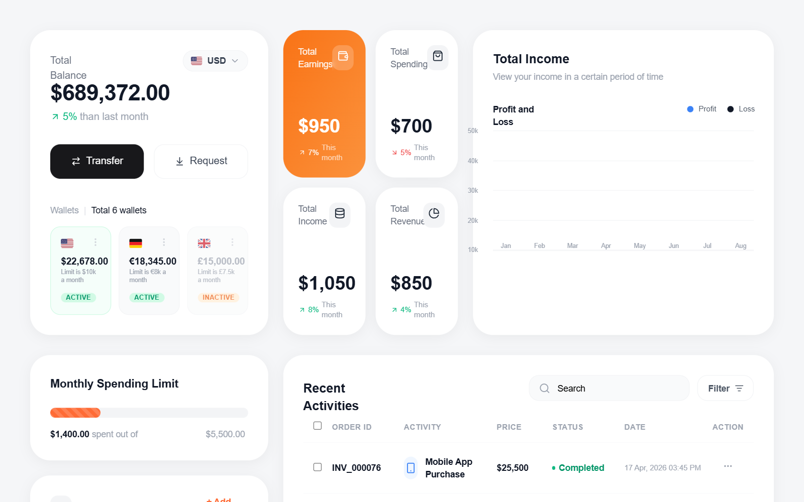
Fintech Dashboard with Line Chart
A high-fidelity fintech dashboard featuring a clean, modern aesthetic with a focus on data visualization and personal finance management. Key features include a smooth SVG line chart with dual-axis data points, high-radius card components (32px), a multi-currency wallet system, and a detailed transaction table. The style is defined by its use of the 'Outfit' typeface, a vibrant orange (#FF6B35) and blue (#3B82F6) color palette against a light gray background (#F5F6F8). Suitable for banking apps, investment platforms, SaaS analytics, and crypto dashboards.
Summary
Design a modern, professional fintech dashboard using a high-radius card grid. The layout prioritizes visibility of total balance, quick stats, a smooth bezier-curve line chart, and an itemized activity list. Use a light background with subtle shadows and large border radii to create a friendly yet sophisticated financial environment.
Style
The style is characterized by wide-set typography (Outfit), rounded corners (32px on cards), and a palette of charcoal, bright orange, and tech-blue. It utilizes glassmorphism-lite (low opacity overlays) for status tags and interactive elements. Animations are implied through hover states and smooth transitions, while charts use SVG paths for fluid data representation.
Layout & Structure
The layout is a 12-column grid system. The top section (Header/Hero) displays primary balance and metrics. The middle section holds a wide line chart and a 2x2 grid of small metric cards. The bottom section is split into a narrow sidebar for cards/limits and a wide main area for transaction history.
Total Balance Card
Earning and Stats Grid
Smooth Line Chart Section
Monthly Spending and Cards
Recent Activities Table
Components
Progress Stripe Bar
A progress bar with a diagonal animated-feel stripe overlay.
Credit Card Mockup
Miniature bank card visualization with glassmorphism status pill.
Smooth SVG Line Chart
Double line chart using SVG paths for organic, curved data representation.
Special Notes
MUST: Maintain the 32px border radius for all primary dashboard cards to ensure the visual signature of the design. MUST: Use the progress-stripe class for progress bars (diagonal stripes at 45deg). MUST NOT: Use sharp corners or harsh black colors; stick to #18181B or Zinc-900 for 'black' elements. MUST NOT: Over-clutter the line chart; keep only 5 horizontal grid lines.