Fountn — Teal Frame Industrial Homepage
An industrial-premium design system featuring a 'Teal Frame' aesthetic with embossed 3D depth effects. Characterized by a dark-mode palette (#0A0A0A), metallic yellow accents (#FACC15), and a signature teal border system (#2D9C84). This style is optimized for curated directories, design resource hubs, high-end SaaS dashboards, and creative portfolios that require a sophisticated, structured, and 'physical' interface feel. It utilizes subtle noise textures, metallic gradients, and complex shadow layering to achieve a tactile, high-fidelity look.
Summary
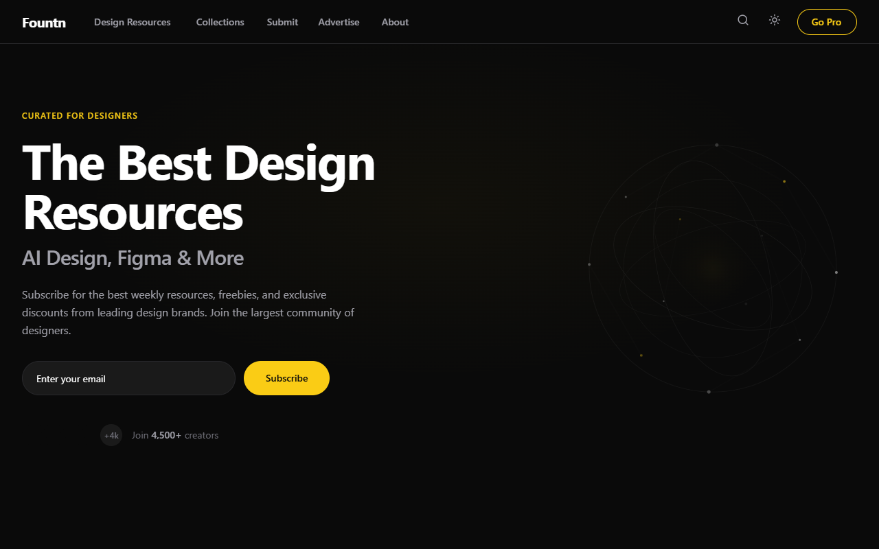
A high-fidelity dark industrial UI featuring a fixed sidebar, embossed teal-bordered cards, and metallic yellow primary actions. The design balances a brutalist structural layout with premium finishes like noise grain textures and soft glows.
Style
Industrial Dark Mode with Teal Accents. Typography uses 'Inter' for a clean, structural feel with wide-tracking headers. The color palette centers on a deep black (#0A0A0A) background, teal borders (#2D9C84) that act as 3D frames, and a high-contrast yellow (#FACC15) for buttons. Transitions are smooth (0.35s cubic-bezier) and cards feature heavy, realistic shadows and interior metallic gradients.
Layout & Structure
Fixed sidebar navigation paired with a scrollable main content area. Content follows a hierarchical flow: Hero -> Horizontal Carousel -> Search/Filter Bar -> Multi-column Resource Grid.
Sidebar Navigation
Hero Section
Featured Carousel
Resource Filter Bar
Main Resource Grid
Components
Teal Embossed Frame
A container that looks like a physical glass-and-metal frame.
Metallic Yellow CTA
A button with a machined gold/metal appearance.
Section Gap Divider
A subtle horizontal rule that adds depth between sections.
Special Notes
Must-Dos: Maintain the 1.5px teal border thickness across all interactive containers; use the #FACC15 yellow sparingly for high-priority CTA only. Must-Nots: Avoid using flat colors for backgrounds—always use subtle gradients or noise; do not use standard blue links—all interactive text should be white or yellow.