Fun Facts LIVE - Retro Punk Dashboard
A high-energy 1970s retro-punk and brutalist mobile interface designed for immersive content discovery and community engagement. This style guide features a high-contrast 'primary color' palette (Retro Red, Blue, and Yellow) set against a vintage beige background. Key characteristics include heavy 6px-12px charcoal borders, hard block shadows (no blur), and an editorial layout with bold, uppercase Montserrat typography. Suitable for edutainment apps, music discovery, niche social feeds, or radical fintech dashboards that prioritize 'attitude' and tactile visual feedback.
Summary
A bold, tactile mobile dashboard featuring 70s-style punk aesthetics, heavy editorial borders, hard block shadows, and vibrant primary accents. The design uses a fixed navigation structure with an interactive graffiti-style map and immersive cards that transition from grayscale to color on interaction.
Style
The style is 'Retro Brutalist'—combining 70s color pops with raw, heavy-duty UI elements. It uses a base of Beige (#F5F1E3) and Charcoal (#2C2C2C). Typography pairs the ultra-bold, high-character Montserrat for headers with the legible Open Sans for body text. Animations are snappy and 'pop-out', utilizing cubic-bezier curves for bouncy, tactile interactions.
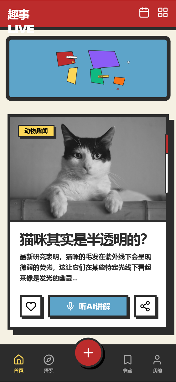
Layout & Structure
A vertical-scrolling mobile layout composed of a sticky header, a condensed map overview, and a series of high-impact content cards.
Sticky Header
Graffiti Map Section
Immersive Feed Area
Content Card
Bottom Navigation Bar
Components
Tactile Action Button
High-contrast primary color button with physical-press feedback.
Pulsing Map Hotspot
Hand-drawn style interactive point on the map.