Gallery-First Product Page
Visual-first layout with a dominant image gallery at the top and product info flowing below. Reduces visual competition between imagery and purchase actions. Ideal for browsing-heavy behavior. Best suited for Fashion, lifestyle products, visually driven brands, products where aesthetics drive desire.
Summary
A clean, structured e-commerce product page that emphasizes visual hierarchy through whitespace and typography rather than color. It features a full-width horizontal gallery, centered primary information, and a detailed two-column technical breakdown at the bottom.
Style
Monochrome editorial style with high-contrast typography. Uses 'General Sans' for main headings/body and 'JetBrains Mono' for technical details and meta-labels. The palette is restricted to #000000, #FFFFFF, and varying shades of gray (#F3F4F6 for backgrounds, #D1D5DB for borders). Animations include smooth horizontal scrolling with snap-alignment and subtle hover states on buttons.
Layout & Structure
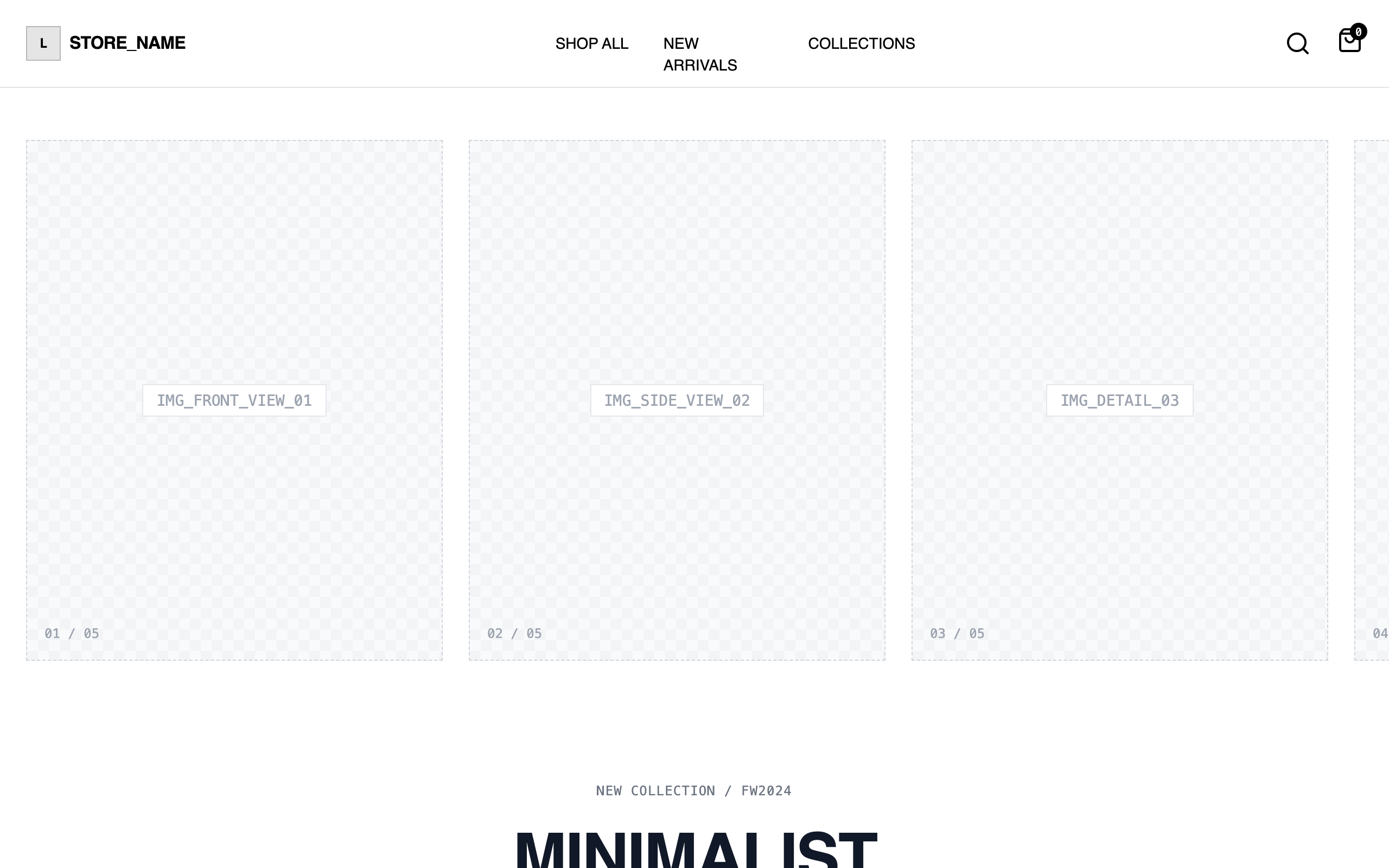
A vertical stack consisting of a sticky header, a wide horizontal gallery, a centered product summary, a two-column detail grid, and a sticky transactional footer.
Header
Horizontal Gallery
Product Info
Detail Grid
Sticky Footer CTA
Components
Material Map Progress Bar
A technical visualization of fabric composition.
Gallery Scroll Indicator
Mobile-only visual cue for image navigation.
Special Notes
Must maintain a strict monochrome palette. Do not use rounded corners except for color swatches; keep all other elements (buttons, inputs, images) with 0px border-radius for an architectural feel. The 'General Sans' heading must use tight line-height (0.9) to create a 'blocky' typographic look. All image placeholders must maintain a consistent 4:5 aspect ratio.