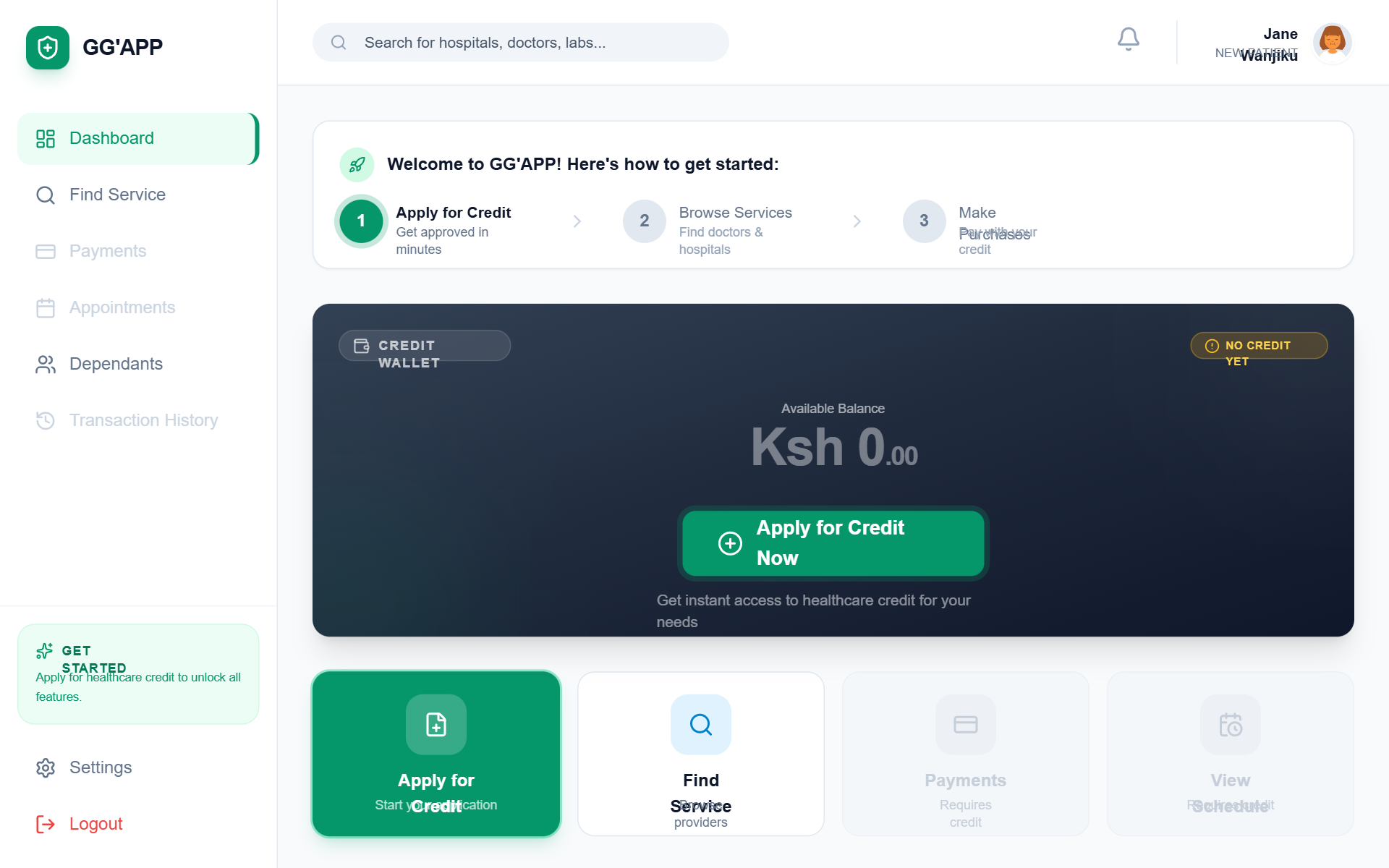
GG'APP New Patient Dashboard
A premium, healthcare-focused fintech dashboard for patient onboarding. Featuring a clean emerald and slate palette, it uses 'General Sans' for modern display typography and 'Satoshi' for body text. The layout is a sophisticated SaaS-style dashboard with a fixed sidebar, sticky header, and a responsive grid system. Highlights include a dark-mode credit wallet card with glassmorphism effects, a three-step onboarding progress tracker, and a bento-style quick actions grid. Ideal for health-tech, fintech, insurance portals, and patient management systems requiring a welcoming but professional entry point.
Summary
A clean, trust-inspiring patient portal designed to guide new users through their first financial and medical interactions. It features a high-contrast dark credit card component, a clear progress-based onboarding banner, and a functional sidebar layout using a professional emerald green (#059669) as the primary brand color.
Style
The style blends high-end fintech aesthetics with medical professionalism. It uses a dual-font system (General Sans for headings, Satoshi for UI/body), a minimalist light gray background (#F8FAFC), and high-quality iconography. Key visual drivers include subtle pulse-glow animations for CTAs, 24px rounded corners for cards, and refined drop shadows.
Layout & Structure
A standard sidebar-content architecture. The main content is constrained to a 1152px (max-w-6xl) container for readability, utilizing a modular grid for quick actions and news feeds.
Fixed Sidebar
Sticky Header
Onboarding Progress Banner
Credit Wallet Card
Quick Actions Grid
Empty State Transaction List
Components
Pulse-Glow CTA Button
A high-attention button used for primary onboarding conversion.
Health News Feed Item
Horizontal card with image for editorial content.
Special Notes
MUST: Use specific font pairing (General Sans/Satoshi) to maintain the tech-forward medical feel. MUST: Maintain a strict #059669 color for all success/primary actions. MUST NOT: Use generic rounded corners; specifically use 24px (1.5rem) for main cards to create the soft, premium feel. MUST: Ensure disabled states are clearly visual-locked with 50% opacity to prevent user frustration.