Graphic Comparison Report
A highly visual, typography-driven comparison report design. This style eschews traditional tables and icons for a bold, editorial layout inspired by graphic posters. Featuring a brutalist-lite aesthetic with high-contrast 'ink' and 'paper' tones, it utilizes oversized headlines, a strict 12-column grid, and structural 2px borders. Suitable for technical comparisons, whitepapers, B2B SaaS decision pages, fintech analysis, and deep-dive product evaluations where clarity and authority are paramount.
Summary
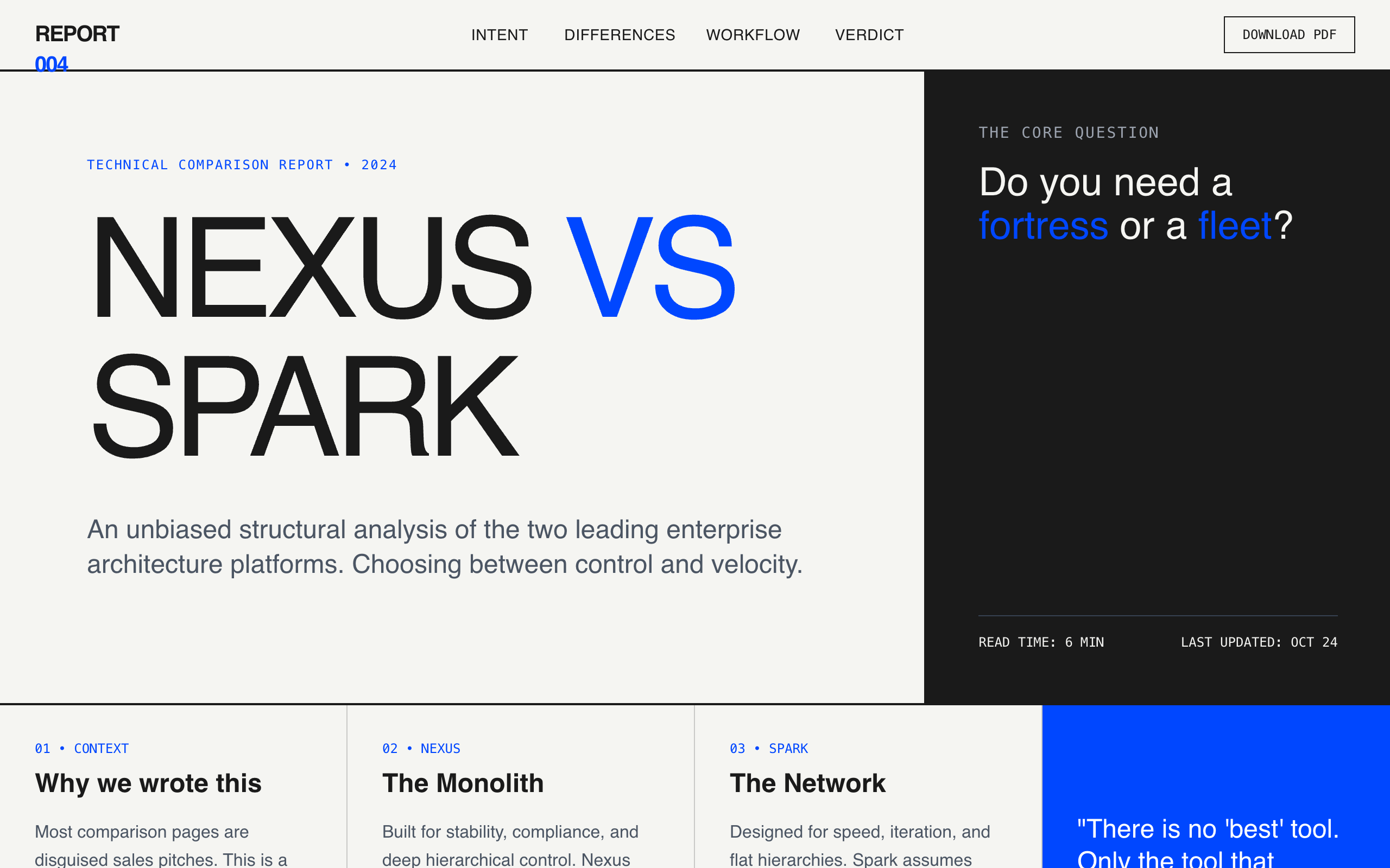
A sophisticated, text-first comparison report that uses a 'poster' aesthetic. It features heavy typography, a stark color palette with a single vibrant accent, and a layout that treats information as graphic blocks. The design prioritizes readability and architectural clarity through rigid grid systems and visible dividing lines.
Style
The style is defined by a pairing of 'Space Grotesk' (display) and 'Inter' (sans). It uses a muted off-white background (#F5F5F2) and near-black text (#1A1A1A) to mimic a high-quality print report. A vibrant 'Cobalt' blue (#0047FF) is used sparingly for accents and structural markers. Design relies on weight, scale, and 2px borders rather than shadows or gradients.
Layout & Structure
The layout follows a modular grid system that transitions between full-width hero sections and multi-column comparison blocks. It uses vertical and horizontal borders to define content cells, creating a sense of a structured physical document.
Fixed Navigation
Hero Section
Context Bar
Scenario Grid
Sticky Comparison (Core DNA)
Feature Matrix
Workflow Narrative
Decision Summary CTA
Components
Side-by-Side Narrative Cards
A split-screen storytelling component that uses contrasting backgrounds to highlight differences.
Truth Matrix
A list-based comparison that uses plus and minus symbols for unbiased assessments.