Header-First Detail Page
This style is optimized for SaaS productivity tools, project management apps, fintech dashboards, and technical documentation. It features a fixed header-and-footer layout with an independent scrollable content area, utilizing the General Sans typeface for a modern, professional aesthetic. Key design elements include bento-style metadata grids, timeline activity feeds, and horizontal-scroll attachment galleries.
Summary
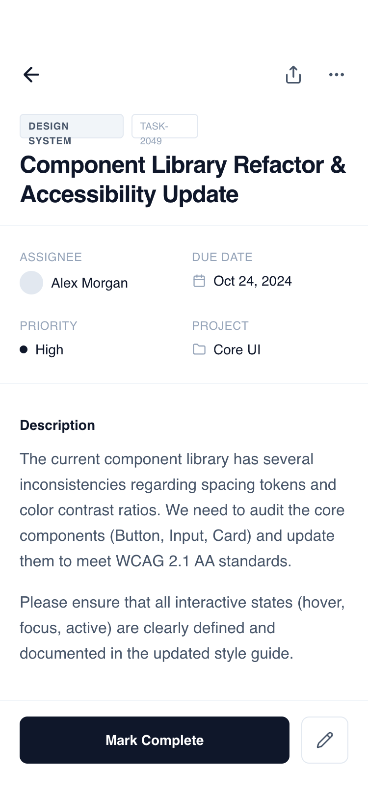
A clean, functional mobile detail wireframe with a fixed header and bottom action bar. The design uses a grayscale slate palette (#0F172A to #F8FAFC) and the 'General Sans' font family to create a clear information architecture. It supports complex data through a modular section-based layout including metadata grids, task checklists, and activity timelines.
Style
The style is 'Minimalist Functional' using a monochrome slate color scale. Typography is centered around 'General Sans' with heavy use of font-weight variation and letter-spacing for hierarchy. UI elements use subtle borders (#F1F5F9) and soft background fills (#F8FAFC) instead of heavy shadows. Interactions are defined by smooth color transitions and discrete hover states.
Layout & Structure
A classic mobile 'Detail View' structure with a 100vh container. It consists of a fixed top header, a middle flexible scrolling container, and a fixed bottom action bar to ensure primary triggers are always accessible.
Fixed Header
Content - Metadata Grid
Content - Description & Checklist
Content - Horizontal Gallery
Content - Activity Timeline
Fixed Footer Action Bar
Components
Status Change Badge
A compact UI element showing a transition between two states.
Bento Metadata Item
Standardized data point for technical or project details.
Special Notes
MUST maintain strict grayscale consistency; do not use brand colors. MUST use the safe area padding (pb-34px) for the footer to support modern mobile notch/home bars. MUST use 'General Sans' or a high-quality equivalent like Inter to maintain the editorial feel. MUST ensure all interactive buttons have a defined hover/active state (bg-slate-50 or opacity change). DO NOT use heavy drop shadows; rely on borders and subtle background fills for depth.