Hero + Sticky Action Detail
Features a fixed action bar with safe-area anchoring, 4:5 hero visuals, and subtle glassmorphism effects on floating elements. Ideal for luxury retail, furniture showcases, editorial commerce, and minimalist lifestyle apps.
Summary
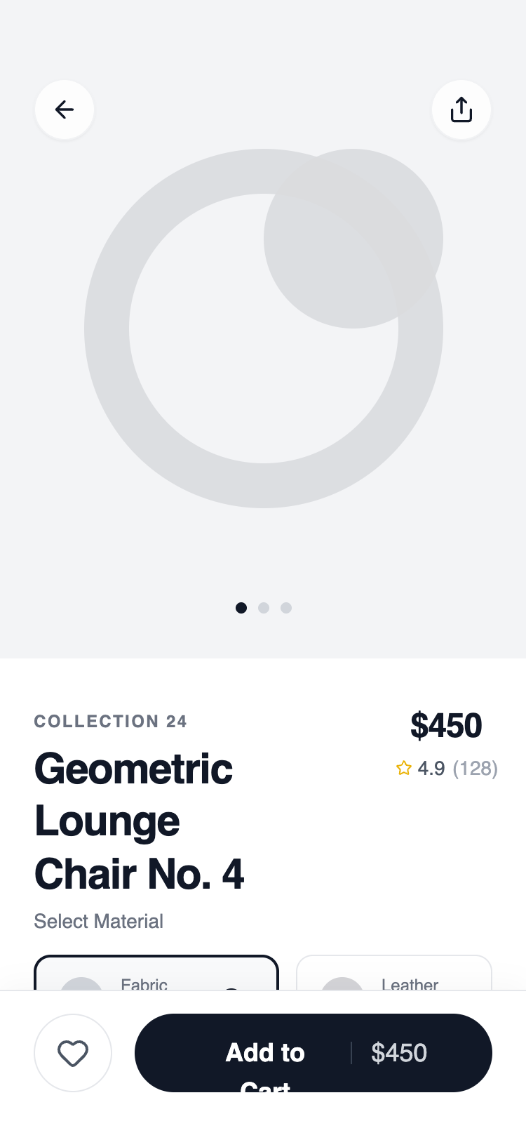
A sophisticated mobile product detail wireframe using a clean, monochromatic design language. It utilizes strong typographic weights, architectural spacing, and a persistent bottom action bar to drive conversions while maintaining a premium, airy aesthetic.
Style
The style is defined by its 'Satoshi' sans-serif typography, ranging from extra-bold headers to wide-tracked uppercase tags. The color palette is strictly grayscale (using Tailwind's gray-50 through gray-900) with a focus on tactile interaction through subtle scale transforms and backdrop blurs. Shadows are minimal, relying instead on 1px borders (#E5E7EB) and background shifts for depth.
Layout & Structure
A vertical scrollable container with a fixed top navigation and a sticky bottom action bar. The content flows from a large visual hero into a structured information hierarchy.
Fixed Navigation
Hero Section
Product Header Block
Horizontal Variant Selector
Feature Grid
Sticky Action Bar
Components
Haptic Button
A button that provides visual feedback on tap.
Geometric Variant Card
A rich variant selector card with visual and text cues.
Special Notes
MUST use Satoshi or a similar high-quality geometric sans-serif. MUST ensure the bottom action bar includes the iOS/Android safe area padding to prevent overlap with home indicators. DO NOT use vibrant colors; stick to the grayscale palette except for very specific functional icons (rating stars, heart). MUST use backdrop blurs for all fixed overlays to maintain the 'glass' feel.