Hybrid Tab +FAB Navigation
A combined system where bottom tabs handle global navigation while a floating action button provides instant access to high-frequency actions across all sections. Best Suitable For Social apps, productivity platforms, content creation tools, AI assistants.
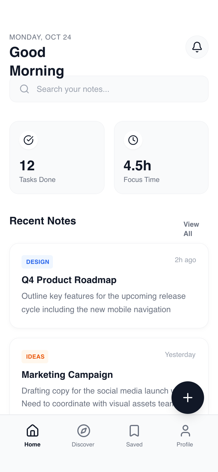
Summary
A high-fidelity mobile UI system focused on a minimal hybrid navigation structure. It combines a sticky 'glass' header with a fixed bottom navigation bar and a high-contrast Floating Action Button. The design prioritizes content clarity using the Manrope font family, generous white space, and subtle 'click-pop' micro-interactions for a premium feel.
Style
Modern Minimalist / Clean Tech. Primarily monochrome (#FFFFFF and #111827) with soft gray accents (#F9FAFB, #F3F4F6) and high-saturation highlights (Blue-600, Orange-600) for categorization. Typography uses 'Manrope' extensively, ranging from 800-weight headers to 10px bold captions. Animations are snappy (200ms) with scale-down effects on active states and subtle opacity fades for tab transitions.
Layout & Structure
A strictly mobile-first layout (max 375px-414px width) utilizing a four-tier vertical architecture: Sticky Header, Scrollable Main Content, Floating Action Button, and Fixed Bottom Navigation.
Header Section
Search & Stats Grid
Content Cards
Bottom Navigation
Components
Interactive FAB
A high-contrast floating button with rotational feedback.
Floating Toast
A temporary feedback notification.
Category Pills
Subtle color-coded metadata tags.
Special Notes
Must maintain consistent 16px (4rem) horizontal padding across all containers. Transition between content tabs must use an opacity fade (0 to 1) over 200ms. Floating Action Button must always sit exactly 100px from the bottom to avoid overlap with the nav bar. Never use pure black (#000000); always use #111827 for deep text and backgrounds.