Impatiens Education Mini-App Homepage
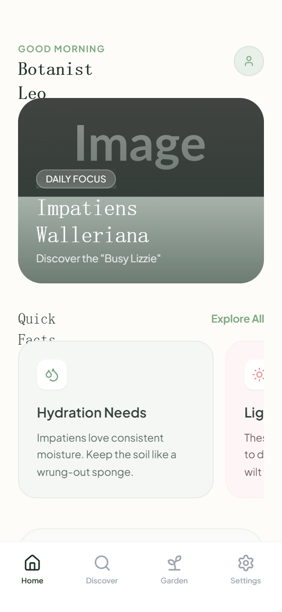
A botanical-inspired, soft minimalist design system characterized by organic curves, a warm cream and sage green palette, and editorial serif typography. This aesthetic is ideal for lifestyle, education, wellness, or plant-care applications, emphasizing a calm and organized user experience. Key visual markers include large border radii (up to 32px), delicate borders (#E1E9E2), and sophisticated font pairing between 'Gambetta' serif and 'Plus Jakarta Sans'. The layout features horizontal-scrolling card carousels, immersive hero sections with glassmorphism overlays, and a bottom-tab navigation system typical of modern mobile mini-apps.
Summary
A fresh, educational mobile UI design featuring a high-contrast 'Forest and Cream' theme, sophisticated serif headings, and large, rounded components that create an approachable, organic feel. The interface uses subtle color accents to differentiate categories (e.g., sage green for general info, soft coral for warnings or specific tips).
Style
The style combines a warm off-white background (#FDFCF8) with deep forest greens (#1A2E22) and muted sage accents (#7BA880). Typography uses 'Gambetta' (serif) for headings to provide an editorial, authoritative look, and 'Plus Jakarta Sans' for interface elements for readability. Components feature aggressive rounding (24px-32px), subtle borders (1px solid with 10-20% opacity), and light shadows. Micro-interactions include horizontal scrolling with hidden scrollbars and backdrop-blur glassmorphism effects on overlays.
Layout & Structure
A vertical-scrolling mobile-first layout with a fixed header and footer. Content is organized into distinct semantic sections: Hero, Horizontal Carousel, and Featured Blocks.
Header
Hero Section
Quick Facts Carousel
Featured Lesson Block
Bottom Navigation
Components
Glassmorphism Badge
Transparent floating tag used for categories over imagery.
Soft Fact Card
Information cards with unique color-coding based on content type.