Kahani — Hero-First Immersive (Production-Ready)
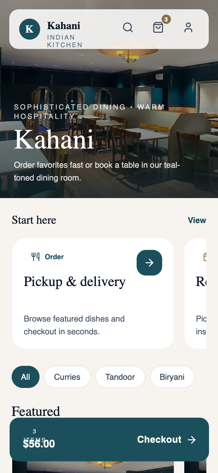
Kahani is a premium, hero-first immersive dining app design characterized by a sophisticated palette of deep teal, warm wood, and off-white. It uses an elegant serif (Zodiak) paired with clean sans-serif (Satoshi) to create a high-end, editorial feel suitable for fine dining, luxury lifestyle, or premium e-commerce verticals. The layout features a 50vh immersive hero section with sophisticated dark gradient overlays, floating glassmorphism navigation, and horizontal scrollable product cards with soft, tinted shadows. Key visual techniques include scroll-triggered soft-rise animations, view transitions, and high-contrast typography with generous tracking for uppercase tags.
Summary
A production-ready mobile interface for a high-end restaurant brand, focusing on an immersive full-width hero image, elegant serif typography, and a refined teal-and-cream color scheme. The design avoids playful elements in favor of a sophisticated, editorial aesthetic.
Style
Sophisticated and elegant theme using a palette of Deep Teal (#1B4F5C), Teal Accent (#2D7A8E), Warm Wood (#8B6F47), and Cream (#F5F3F0). Typography features a high-contrast pairing of Zodiak (Serif) for headings and Satoshi (Sans-Serif) for body text. Animations are subtle, utilizing cubic-bezier(0.4, 0, 0.2, 1) for soft-rise entries and view transitions for page states.
Layout & Structure
Mobile-first layout (375px width focus) centered around a 50vh immersive hero. Below the fold, content is organized into logical sections with consistent padding (20px), utilizing horizontal scrolling for item discovery and high-contrast cards for primary actions.
Floating Navigation
Immersive Hero Section
Featured Horizontal Scroll
Quick Book Card
Info/About Section
Components
Floating Checkout Bar
A fixed-position bottom CTA for conversion.
Special Notes
Must-dos: Maintain high contrast between white text and dark gradients on images; ensure serif headings are at least 2xl for readability. Must-nots: Do not use gold, bright yellows, or playful rounded 'pill' shapes for main cards; do not use standard system sans-serif fonts—the editorial feel depends on the specific typeface pairing.