Kahani — Hero-First Immersive (Production-Ready)
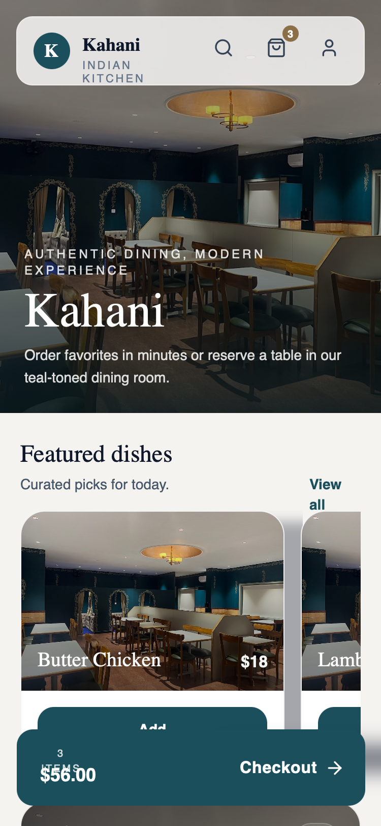
A premium, editorial-style mobile UI design characterized by a sophisticated palette of deep teal, wood, and cream. This style features high-impact immersive hero sections, elegant serif typography (Zodiak), and clean sans-serif pairing (Satoshi). Designed for the hospitality and high-end dining industry, it utilizes scroll-triggered soft-rise animations, backdrop-blur effects, and a floating navigation structure to create a refined, luxury brand experience. Layouts emphasize visual storytelling through large photography with dark gradient overlays for readability and high-contrast card components.
Summary
The 'Kahani' design system is a production-ready, hero-first immersive layout for premium hospitality apps. It uses a deep teal (#1B4F5C) and off-white (#F5F3F0) palette to evoke elegance. Key features include a large viewport-filling hero image, horizontal scrolling product cards with bottom-anchored text, and a persistent floating checkout bar. The design avoids playful elements in favor of refined, cinematic presentation with smooth view transitions and sophisticated spacing.
Style
Typography pairings use 'Zodiak' (serif) for large headings to establish a heritage feel, and 'Satoshi' (sans-serif) for functional UI and body text. The color scheme is anchored by Deep Teal (#1B4F5C) for primary buttons and branding, Wood (#8B6F47) for badges, and Cream (#F5F3F0) for the background. Animations utilize cubic-bezier(0.4, 0, 0.2, 1) for a high-end, responsive feel.
Layout & Structure
A vertical mobile layout starting with a 45-50% viewport height hero section, followed by a dense scrollable body containing horizontal carousels, CTA cards, and information blocks. The experience is capped by a fixed bottom-floating action bar.
Sticky Navigation
Immersive Hero Section
Featured Horizontal Scroll
Quick Book Reservation Card
Floating Bottom CTA
Components
Glassmorphism Nav
A high-clarity floating header with translucent properties.
Info Grid Cards
Detailed information blocks for business metadata.
Special Notes
MUST: Use a mix of Zodiak and Satoshi for a hierarchy between 'Art' and 'Utility'. MUST: Ensure all image overlays use high-contrast dark gradients to maintain white text readability. MUST: Keep scrollbars hidden on horizontal lists. DO NOT: Use gold or bright saturated colors other than the defined Teal. DO NOT: Use sharp corners; use a minimum radius of 12px for small items and 24px for large cards.