Kid-Friendly English Summer Camp Adventure
A vibrant, kid-friendly design system featuring a high-energy 'Playful Professional' aesthetic. It uses a primary palette of bright blue, golden yellow, coral, and teal (#0066CC, #FFD700, #FF6B6B, #4ECDC4) paired with rounded 'Quicksand' typography. The layout is rich with 'blob' shapes, floating animations, and 3D-effect buttons with hard shadows. Ideal for children's educational platforms, summer camps, extracurricular activity centers, and early-learning SaaS. Key features include bouncy hover states, organic image rotations, and soft geometric background patterns.
Summary
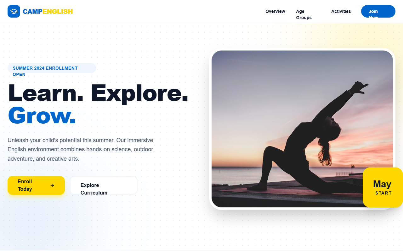
A visually rich landing page design for children's activities that balances playfulness with professional trust. It features large rounded corners, floating decorative elements, high-contrast action buttons with a physical 'pressable' feel, and a mix of photography and illustrative icons.
Style
The style is defined by soft geometric shapes (blobs), bold primary colors, and high-readability rounded typography. Animation is 'bouncy' and 'fluid' using custom cubic-beziers. Backgrounds are not static but feature subtle radial-dot patterns and moving blurs. Text uses a mix of 'Plus Jakarta Sans' for stability and 'Quicksand' for child-friendly appeal.
Layout & Structure
The layout follows a modular section-based structure with high whitespace and organic alignment offsets to prevent a rigid corporate feel.
Navigation
Hero Section
Activity Grid (Curriculum)
Video Showcase
Age Groups / Categories
Teacher/Team Profiles
Enrollment CTA
Components
3D Pressable Button
A button that mimics physical depth.
Organic Floating Badge
Circular callout element used in the hero.
Bouncy Content Card
Standard interactive card for features.