Light Museum - 视觉审核终端 (优化审核统计)
A futuristic visual audit and content moderation terminal featuring a high-end dark mode aesthetic. Utilizing glassmorphism, depth-focused layouts, and a vibrant purple-pink gradient accent system. This design is optimized for SaaS dashboards, fintech platforms, asset management systems, and media moderation tools. Key elements include 3D-transform interactive image previews, floating glass widgets, and editorial typography combining Cabinet Grotesk for high-impact headings and Satoshi for functional body text.
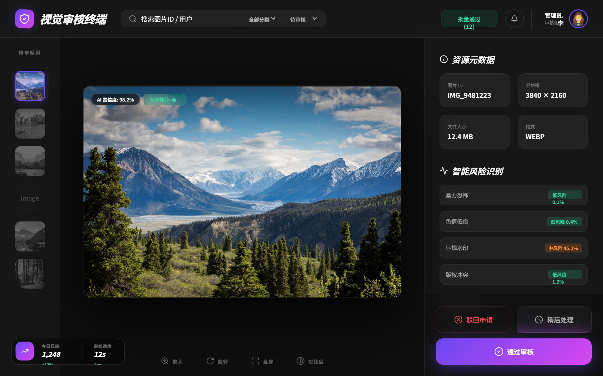
Summary
A sophisticated, high-contrast visual audit interface in dark mode. It uses a three-column layout (Queue, Preview, Data) with glassmorphism panels, interactive hover effects, and a floating statistical widget for real-time monitoring.
Style
The style is 'Cyber-Minimalist' with a heavy emphasis on glassmorphism and light-bleed effects. Primary color is a deep black (#0e0e0e) contrasted with a vivid purple-to-pink gradient (linear-gradient(135deg, #6a48f2 0%, #d946ef 100%)). Typography pairings include 'Cabinet Grotesk' (italic, black weights) for branding and 'Satoshi' for data density. Shadows are glow-based rather than drop-shadow based, using rgba(106, 72, 242, 0.3).
Layout & Structure
A full-height fixed viewport layout consisting of a horizontal header, a thin left sidebar for visual queues, a large central workspace for inspection, and a thick right sidebar for data entry and decision-making.
Header
Left Queue Sidebar
Central Workspace
Right Decision Panel
Floating Stats Widget
Components
Interactive 3D Preview
An image container that tilts based on cursor position for a tactile feel.
Action Button Stack
High-priority decision buttons with distinct visual hierarchy.
Special Notes
Must-dos: Ensure all glass cards have an 8% opacity white border to prevent them from blending into the background. Use 'Cabinet Grotesk' specifically for the terminal's professional but edgy 'italic' aesthetic. Must-nots: Do not use standard shadow offsets; use glow-based drop shadows for primary buttons (#6a48f2 opacity). Do not use solid backgrounds for any secondary elements; maintain transparency and blur throughout.