Minimalist Checkout
A distraction-free, single-column checkout that removes visual competition and guides users step-by-step. Order summary is minimized or collapsible to keep attention on form completion. Best suited for Mobile-first stores, impulse purchases, low-priced items, audiences with short attention spans.
Summary
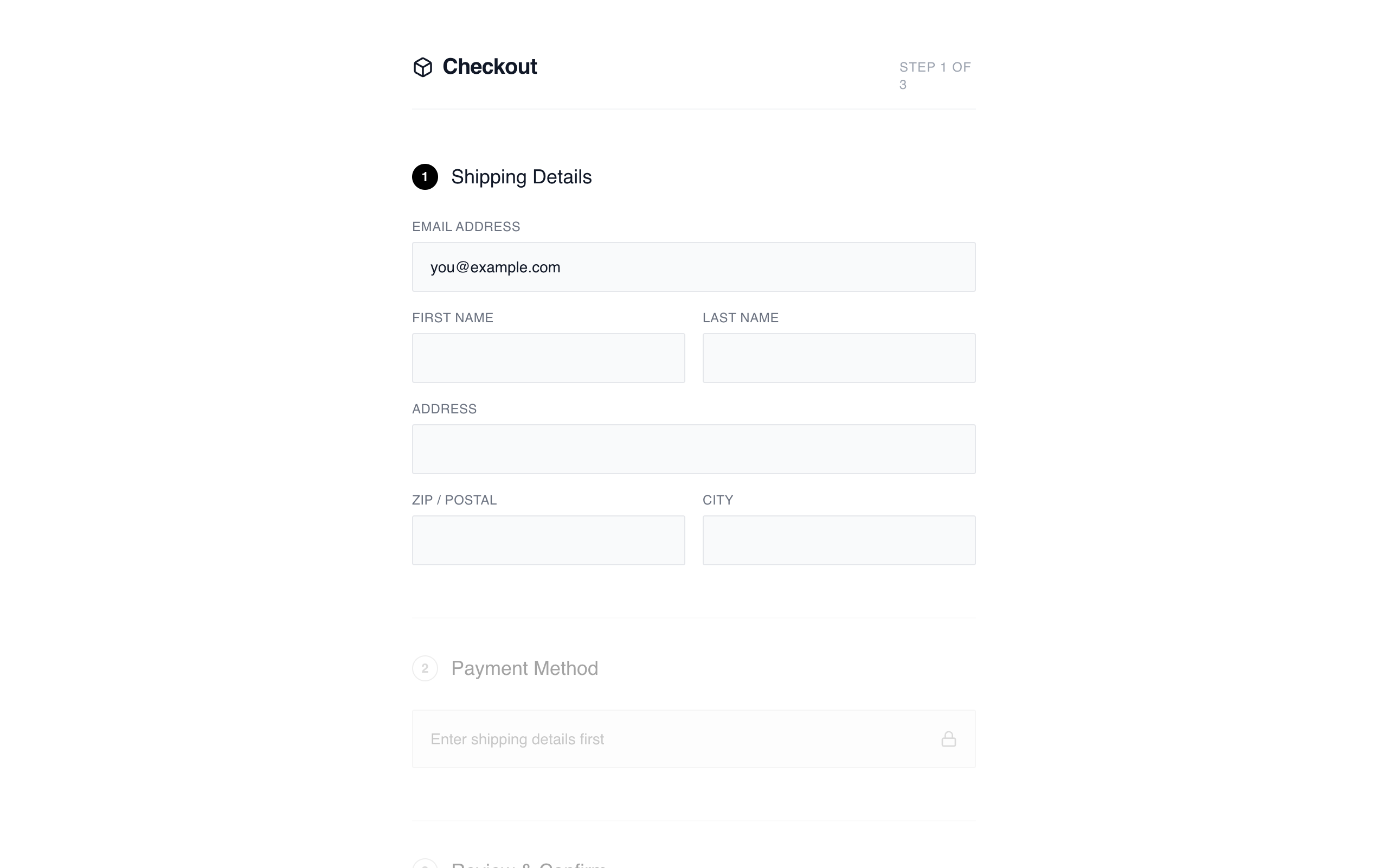
A distraction-free, linear checkout experience focused on visual clarity and functional simplicity. It utilizes a centered 520px column, a step-based progression indicated by numbered badges, and a collapsible summary to keep the user focused on data entry.
Style
Monochrome and minimalist aesthetic. Typography uses 'General Sans' for headings and 'Satoshi' for body text, creating a clean, modern look. The palette is restricted to #000000 (Black), #FFFFFF (White), and various shades of neutral gray for borders and backgrounds. Inputs are understated with #F9FAFB backgrounds and 1px borders. Animations are subtle, including smooth opacity shifts and a 0.99 scale transform on button clicks.
Layout & Structure
Centered single-column layout (max-width 520px) with a vertical flow. The page starts with a clean header, followed by stacked sections for shipping, payment, and review. Inactive steps are visually dimmed to focus user attention. A collapsible order summary is positioned above the final CTA.
Header
Step Sections
Shipping Form
Collapsible Order Summary
Footer CTA
Components
Numbered Progress Badge
A 24px circular indicator used for step navigation.
Minimalist Input Field
Ultra-clean form input with top-aligned labels.
Special Notes
Do not use vibrant colors; stick strictly to the monochrome scale. Ensure all interactive elements have a transition of at least 200ms for border-color and opacity changes. The layout must remain centered and narrow even on wide screens to maintain the focused 'wireframe' feel.