Mobile OTP Verification
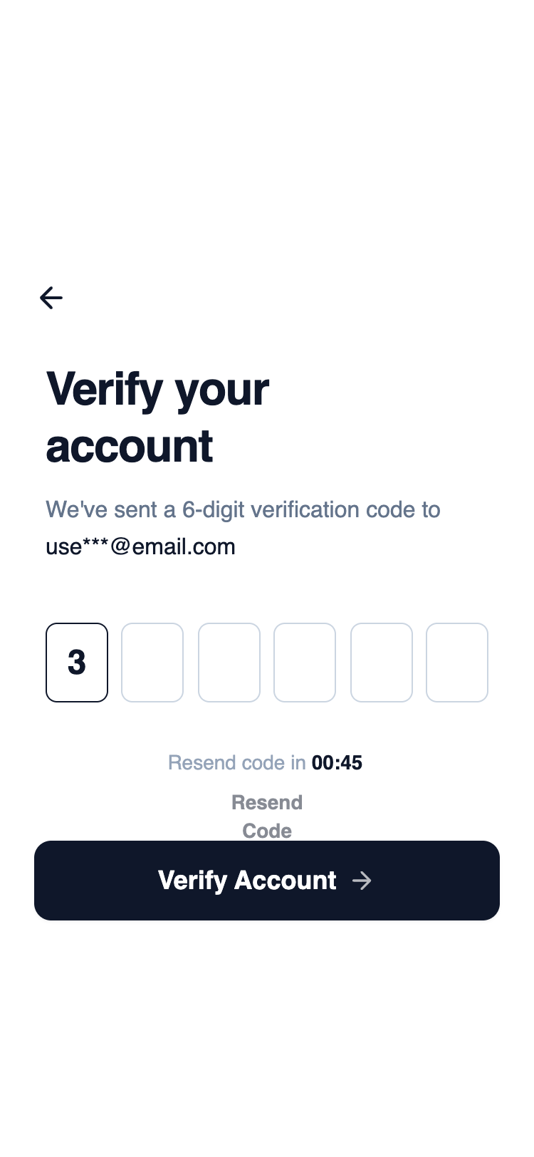
A highly focused layout centered around horizontally aligned OTP input fields. Supporting actions are secondary and visually subdued, keeping attention on code entry and completion.
Summary
A clean, high-contrast mobile OTP verification screen utilizing a wireframe aesthetic. The design prioritizes focus and ease of use with large input fields, a strong typographic hierarchy, and a clear call-to-action.
Style
The style is minimalist wireframe-chic. It uses a monochromatic palette ranging from pure white to slate-900. Typography relies on 'General Sans' for a professional, slightly geometric look. Transitions are subtle (hover and active states) to maintain a fast, performant feel without excessive fluff.
Layout & Structure
A vertical stack optimized for mobile viewports (375px max width), divided into a top header, central content area, and a fixed bottom CTA section.
Header
Hero & Content
OTP Input Grid
Timer & Feedback
Footer CTA
Components
Individual OTP Field
A specialized 1-digit input field designed for code entry.
Haptic Button
Primary action button with physical interaction feedback.
Special Notes
MUST: Maintain strict monochrome levels; any addition of color (blue/red) will break the wireframe aesthetic. MUST: Use 'tabular-nums' for the countdown to prevent horizontal text jitter. DO NOT: Increase border thickness beyond 1px as it loses the minimalist feel. MUST: Ensure inputs are exactly 56px tall to match the height of the CTA button for visual harmony.