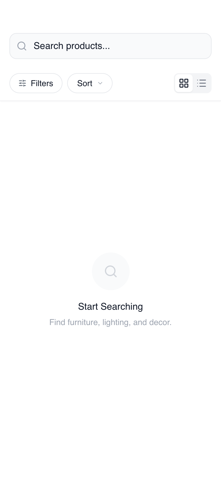
Mobile Search & Browse
Features a sticky search header, grid/list view toggles, and a slide-up filter bottom sheet. Ideal for premium retail, furniture, or fashion apps requiring a 'wireframe-plus' aesthetic where the focus is on structure and usability before brand-specific colors are applied. Optimized for high-performance mobile browsing with scroll-triggered headers and skeleton loading states.
Summary
A minimalist, functional mobile browse and search interface utilizing a grayscale wireframe aesthetic with high-polish interactions. The design centers on a persistent header containing search and filter controls, a dynamic results area supporting grid and list views, and an expandable bottom-sheet filter panel with advanced UI controls like range sliders and toggle switches.
Style
Clean, modern minimalist style using General Sans typography. The color palette is strictly neutral (#FFFFFF to #111827) with subtle depth provided by Gray-50 and Gray-100 backgrounds. Interactions are characterized by cubic-bezier easing for drawers and a linear shimmer effect for loading states. Borders are thin (1px) and subtle, using #E5E7EB.
Layout & Structure
A three-part mobile layout consisting of a sticky navigation/filter header, a scrollable main results container, and an overlay-based filter drawer.
Sticky Header
Main Content Area
Filter Bottom Sheet
Components
Shimmer Skeleton
Animated loading placeholder for cards.
Interactive Toggle Switch
Standard binary switch for filters.
Special Notes
MUST maintain the 1px border consistency across all UI elements. MUST use General Sans for all text; fallback to sans-serif is only acceptable if General Sans fails to load. MUST ensure the bottom sheet drawer uses a springy cubic-bezier transition for a 'native' feel. DO NOT use vibrant colors; stick to the #000-#FFF grayscale to preserve the wireframe intent. DO NOT use sharp corners; all structural elements should have at least an 8px radius.