Modern Minimalist Home - Updated Profile Link
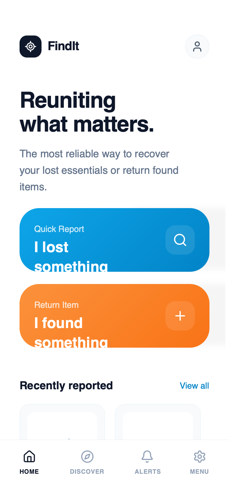
A modern minimalist mobile interface designed for service-oriented applications like lost and found, community tools, or local marketplaces. The design features a high-contrast white aesthetic with vibrant gradient action cards (sky blue and orange), editorial typography using General Sans and Satoshi, and a clean bottom navigation bar. It utilizes large border-radii (32px), subtle shadows, and micro-interactions for a premium, app-like feel on the web. Keywords: mobile-first, minimalist, glassmorphism accents, gradient cards, editorial typography, service UI, clean design, view-transitions.
Summary
A clean, high-contrast mobile UI with a focus on editorial typography and bold action cards. It uses a strictly white background with slate-toned text and vibrant gradients to guide user attention.
Style
The style is characterized by sophisticated typography pairing (General Sans for headings, Satoshi for body), a clean white palette (#FFFFFF) accented by Slate-900 for high-contrast elements, and vibrant gradients for primary CTAs. It uses generous corner radii (32px for cards, 12px for icons) and ultra-subtle shadows for depth without clutter.
Layout & Structure
A vertical stack optimized for mobile viewports, including a fixed header, a scrollable main content area containing a hero section, primary action cards, and a horizontal-scrolling recent activity list, finished with a persistent bottom navigation bar.
Header
Hero Section
Primary Action Cards
Recent Activity List
Bottom Navigation
Components
Glassmorphic Icon Box
Small icons inside action cards that use background blur for a premium look.
Gradient Action Card
High-impact navigational cards with specific color ramps.
Special Notes
MUST use 'General Sans' for brand and primary headings to maintain the editorial feel. MUST use 'Satoshi' for body copy for legibility. DO NOT use heavy shadows; the shadow-to-border ratio should favor thin borders and very faint shadows (4% opacity). DO NOT use sharp corners; use minimum 12px for small items and 32px for large containers. Ensure 'view-transition' properties are applied for smooth navigation between states.