Modular Card Dashboard
A high-contrast wireframe dashboard style featuring a modular card-based system. Characterized by a 'neubrutalism-lite' aesthetic with heavy black borders, hard shadows on hover, and a strict grayscale palette. It utilizes clean editorial typography (Switzer) and a minimalist approach to data visualization. Perfect for SaaS management tools, fintech mobile apps, developer dashboards, and productivity interfaces where structural clarity and modularity are prioritized over colorful decoration.
Summary
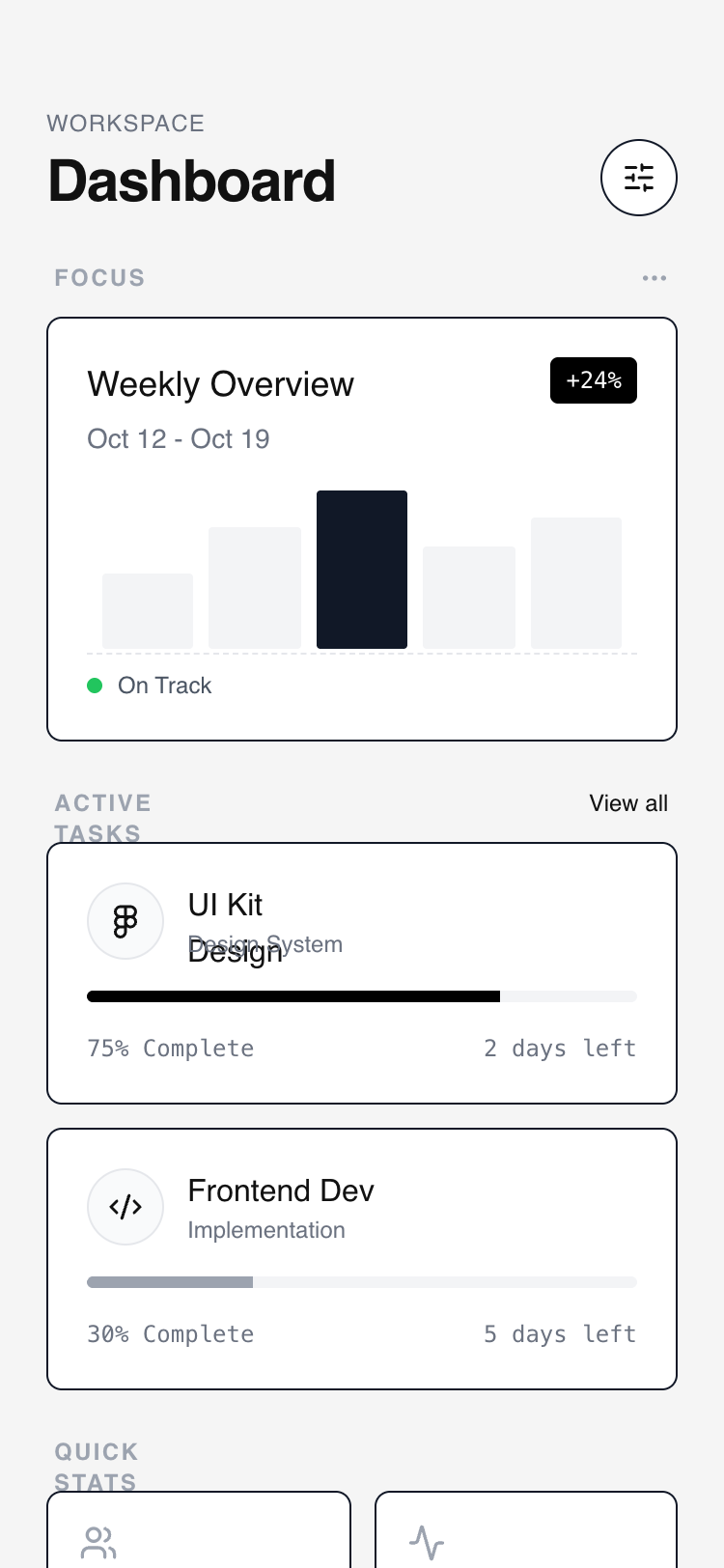
A minimalist, grayscale mobile dashboard design featuring a flexible, modular layout with high-contrast card components, sticky headers with backdrop blurs, and interactive neubrutalist hover effects.
Style
The style is built on a grayscale wireframe foundation. It uses thin but distinct #111111 borders, a light gray background (#F5F5F5) for contrast against white cards, and bold neubrutalist interactions. Typography relies on the Switzer sans-serif family for an editorial, modern feel. Micro-interactions include vertical translations and solid hard-shadow reveals that suggest tactile depth.
Layout & Structure
A vertical mobile-first layout (max 375px) designed for infinite scroll. It follows a hierarchy of priority: Header -> Hero Card -> Repeating Stack -> Dense Grid -> Action Footer.
Sticky Header
Primary Hero Card
Secondary Stacked Cards
Tertiary Stats Grid
Modular Action Footer
Components
Neubrutalist Interactive Card
A white container with a sharp black border and a solid black shadow that appears on interaction.
Wireframe Bar Chart
A minimalist data representation using simple geometric blocks.
Special Notes
Must maintain strict grayscale; do not use accent colors except for specific status indicators (e.g., green for 'On Track'). Ensure all cards have the exact same 1px #111111 border to maintain the wireframe look. Use 'no-scrollbar' utility to keep the mobile UI clean. The hard-shadow on hover must not have a blur-radius (it should be a solid offset color).