Modular Section Builder Product Page
Composable, block-based layout where each section stands alone and can be reordered. Optimized for Shopify theme customization and experimentation. Best suited for Brands iterating frequently, multi-product catalogs, teams running A/B tests or seasonal campaigns.
Summary
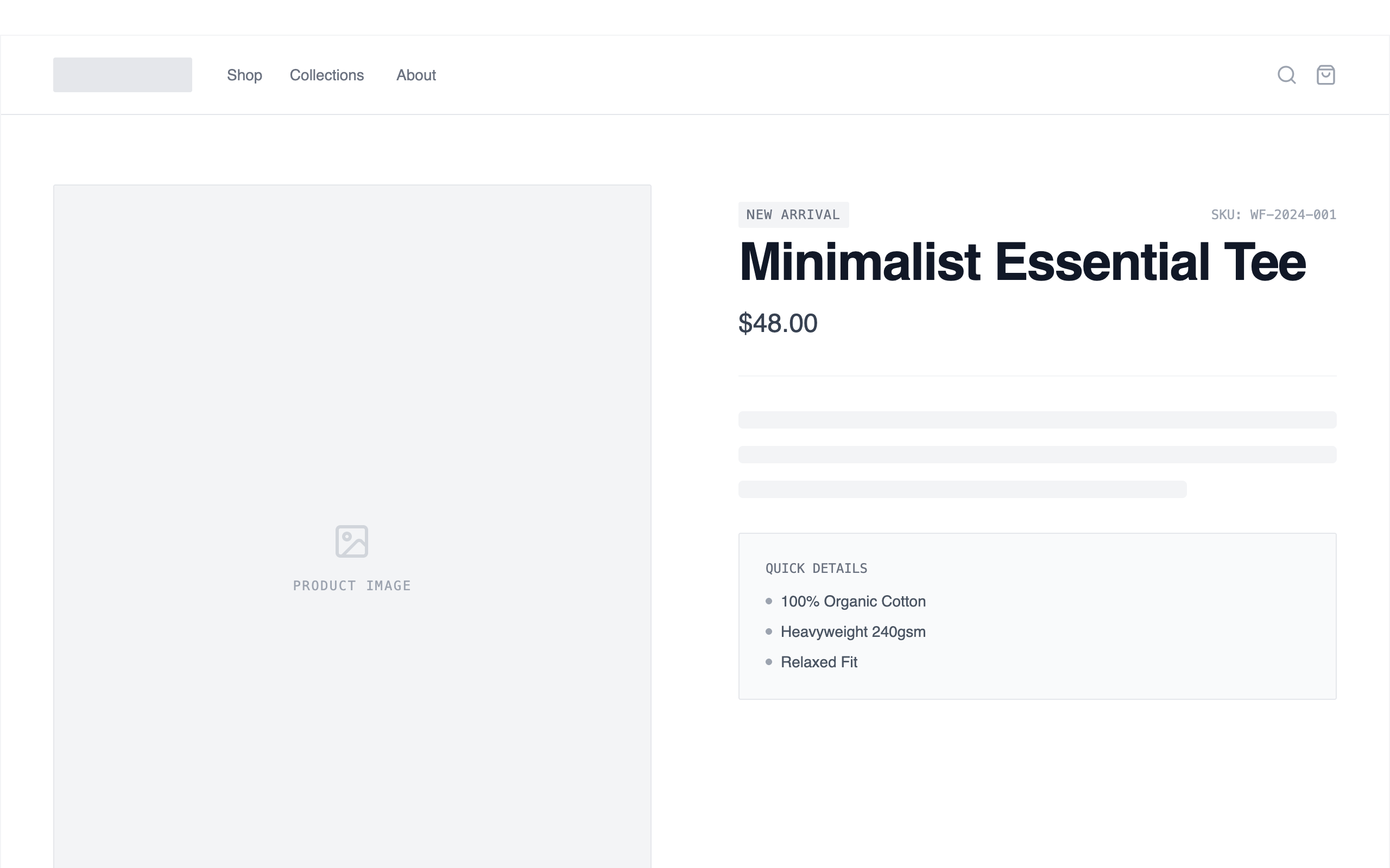
A high-fidelity grayscale e-commerce wireframe design system featuring modular sections, skeleton loaders, and a clean typography hierarchy for rapid product page prototyping.
Style
The style is a professional 'developer-first' wireframe aesthetic. It uses a strict grayscale palette: #2d2d2d (titles), #666666 (body), #e8e8e8 (borders/placeholders), and #ffffff (backgrounds). Typography relies on General Sans for headings and body, with a monospaced font used for technical labels and SKU data. Interaction design includes subtle dashed outlines and drag-handle visibility on hover to indicate modularity.
Layout & Structure
A vertically stacked modular layout within a max-width 1440px container. The structure is built from independent, full-width sections separated by light horizontal dividers (#F3F4F6). Each section utilizes a consistent padding-x of 1.5rem to 3rem (mobile to desktop) and padding-y of 4rem to 6rem.
Header
Product Hero
Feature Highlights
Image + Text Split
Purchase Module
Reviews List
Footer
Components
Drag Handle Indicator
A floating tooltip that appears on section hover to indicate reorderability.
Skeleton Text Loader
Animated placeholders for text content to simulate loading or wireframe status.