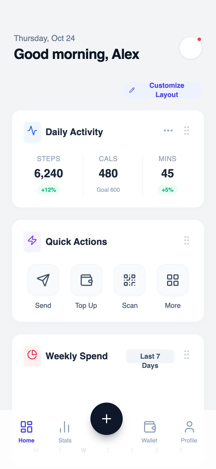
Modular Widget Home
A vertical stack of self-contained widgets, each with its own header and content area. Widgets imply personalization and can be rearranged or toggled. Best Suitable For Power-user apps, analytics tools, admin panels, customizable dashboards.
Summary
A clean, modular dashboard interface designed for mobile-first interaction, using a card-based widget system with subtle shadows, sophisticated typography pairing, and a glassmorphism bottom navigation bar.
Style
The style is defined by a 'Satoshi' and 'Plus Jakarta Sans' typography pairing, a soft grey/blue background (#F2F4F6), and vibrant accent colors (Indigo, Emerald, Rose). Widgets are contained in white rounded cards with extremely subtle borders and soft shadows. Interactions are highlighted by background color shifts (e.g., Indigo-50) and micro-scaling effects.
Layout & Structure
The layout is a single-column vertical scroll of stacked widgets with fixed header and bottom navigation. Spacing is governed by a 20px (px-5) horizontal margin and 20px (gap-5) vertical spacing between cards.
Header
Metric Widget
Quick Actions Grid
Data Visualization Widget
Bottom Navigation
Components
High-Contrast Dark Widget
A dark-themed variant of the standard widget for emphasis.
Interactive Task List
List items with custom checkboxes and priority markers.