Permissions Primer Wireframe
A high-fidelity minimalist permissions primer wireframe designed for mobile onboarding. Features a clean, high-contrast Slate and White color palette, premium Satoshi typography, and a structured vertical layout. Ideal for fintech, SaaS, or health-tech applications requiring a professional and trustworthy 'Soft Ask' before system-level permission prompts. Highlights include 22px-24px icon sizes, rounded-2xl iconography containers, and a sticky glassmorphism footer.
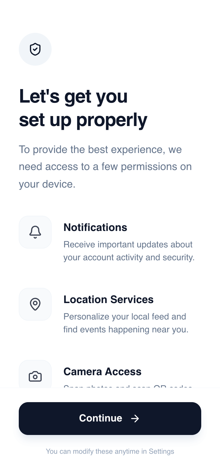
Summary
A clean, professional mobile interface for explaining system permissions. It uses a vertical stack of descriptive rows, a high-impact header, and a sticky primary action button to guide users through necessary app access points with clarity and intent.
Style
Professional minimalist style using the 'Satoshi' sans-serif typeface and a 'Slate' scale color palette. The aesthetic relies on generous whitespace, subtle border contrasts, and high-quality typography hierarchy to establish trust. Interactions are subtle, focusing on smooth hover states and tactile button feedback.
Layout & Structure
A three-part vertical layout: a fixed-width header for context, a scrollable main body for permission rows, and a sticky footer for the primary call to action.
Header Section
Permissions List
Sticky Action Footer
Components
Permission Icon Container
A soft-bordered square icon box with hover feedback.
Primary Action Button
A high-emphasis black button with an arrow indicator.
Special Notes
Do not use interactive toggles or switches; this design is for education/intent, not direct setting manipulation. Ensure the 'Continue' button has a subtle 0.98 scale transform on click for tactile feedback. Maintain strict alignment between the icon boxes and the text labels (align text baseline carefully with top icon padding).