Playful Split-Layout Login
A playful and modern split-layout design system ideal for authentication and onboarding screens. It balances a minimalist, high-contrast user interface with a vibrant, creative brand side featuring floating geometric 'character' illustrations. Key features include editorial typography using the Satoshi font, a neutral-to-vivid color palette (#F3F4F6, #8B5CF6, #111827, #F97316, #FACC15), and subtle micro-interactions like growing underline focus states and 6-second ease-in-out float animations. Perfect for fintech, SaaS, ed-tech, and design-led digital products.
Summary
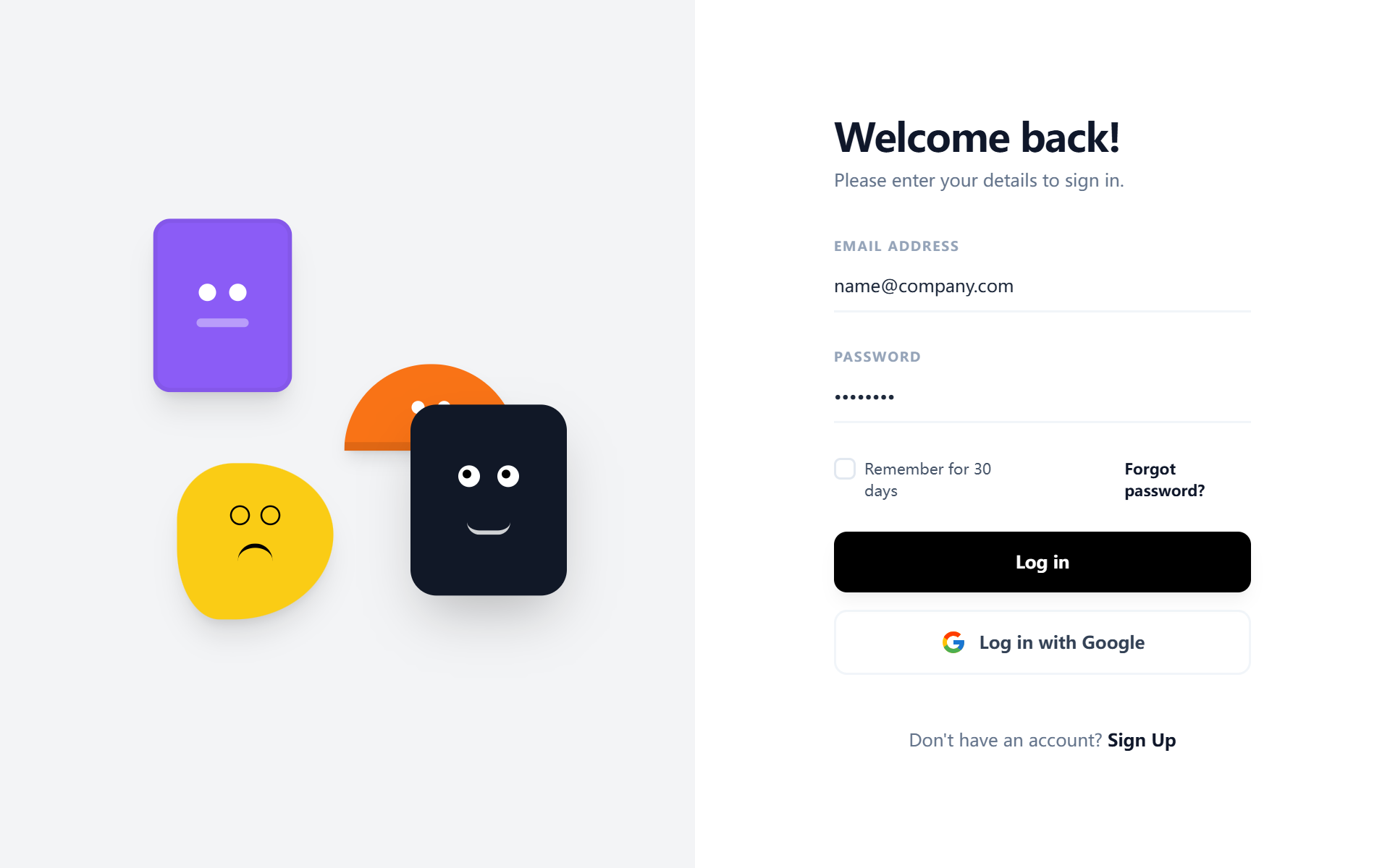
A dual-column authentication layout that pairs a high-utility, minimalist form with a whimsical, abstract geometric illustration side. The design emphasizes clean whitespace, bold typography, and playful character-driven motion.
Style
The style is a blend of geometric minimalism and playful brutalism. It uses the 'Satoshi' font family (400, 500, 700 weights) for a premium, structured feel. Colors are high-contrast: White (#FFFFFF) and light slate for the UI, contrasted with a pop of purple (#8B5CF6), orange (#F97316), and yellow (#FACC15). Animations are smooth and organic, featuring a 6s floating loop for illustrations and a CSS width-transition underline for input focus.
Layout & Structure
A responsive split-screen container. On desktop, the viewport is divided 50/50 vertically. On mobile, the visual branding moves to the top (400px height) and the form follows below.
Visual Branding Section (Left/Top)
Authentication Form (Right/Bottom)
Footer/Navigation
Components
Animated Underline Input
A minimalist input field with a hidden-to-visible animated focus line.
Custom Styled Checkbox
A checkbox that replaces the default browser look with a minimal black-and-white checkmark.
Special Notes
MUST: Use 'Satoshi' font for the specific geometric aesthetic. MUST: Maintain a minimum 50% screen split on desktop to ensure balance. MUST: Implement the animated bottom-border on inputs rather than a standard box-border for a premium look. DO NOT: Use standard stock photos; the visual side depends on abstract, animated vector/CSS shapes. DO NOT: Increase border-radius on inputs beyond the underline style.