Porto Itapoá News Component
An industrial and clean news section design inspired by maritime and logistics aesthetics. It features a primary forest green color palette (#007651), a minimalist 1px grid system, and heavy emphasis on uppercase typography with wide letter spacing. The design uses grayscale imagery with monochromatic overlays to maintain a professional, cohesive brand feel. Suitable for corporate news, logistics portfolios, industrial blogs, and sustainability reports.
Summary
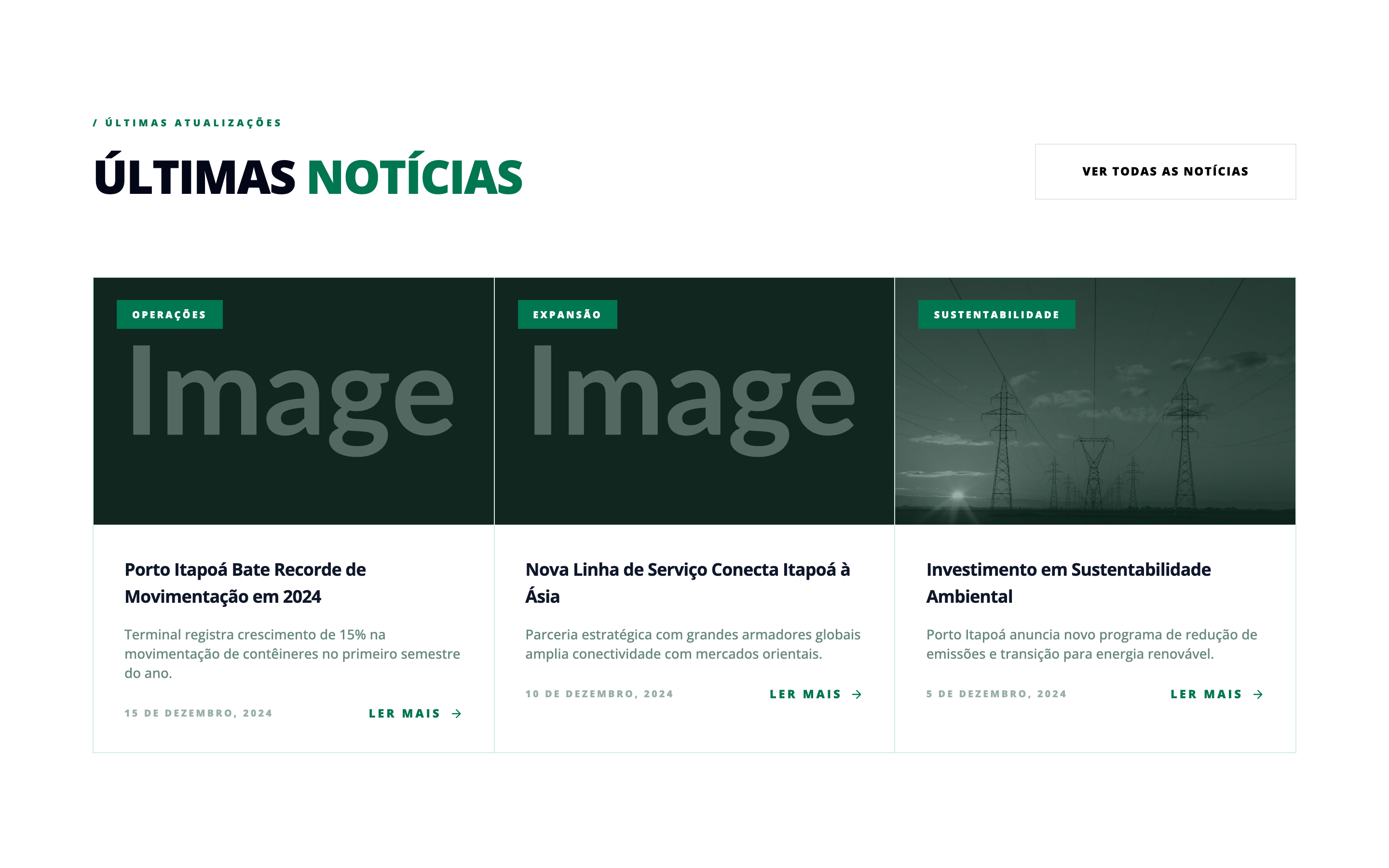
A corporate news grid component featuring a three-column layout with 1px borders, grayscale imagery with dark green overlays, and bold, uppercase typography. The aesthetic is professional, technical, and high-contrast.
Style
The style is characterized by its high-contrast industrial look, utilizing 'Open Sans' across various weights (Black, Bold, Medium). The palette is anchored by a deep Forest Green (#007651) and a very dark Green-Black (slate-950). Layout elements are separated by thin 1px lines in a pale mint green (#d1ede1). Animations include subtle image scaling and horizontal translations of call-to-action arrows.
Layout & Structure
A vertical stack consisting of a header with a right-aligned CTA, followed by a responsive 3-column grid. The grid uses a 1px gap technique where the background color of the container creates the border lines between white cards.
Header Section
News Grid
News Card
Components
Industrial Category Badge
A high-contrast label placed over images.
Grid-Border News Card
A card designed to work within a 1px gap grid system.
Special Notes
MUST maintain the 1px grid line separation for the industrial look. MUST use grayscale filters on all images with the specified green overlay to ensure text legibility and brand consistency. DO NOT use rounded corners; the design relies on sharp 90-degree angles. MUST ensure the 'Read More' text and arrow move together on hover of the entire card, not just the text link.