PredictAI - Results Analysis Dashboard
Bold editorial dashboard style featuring extreme typographic contrast, high-tech minimalism, and a sophisticated dark/light mode execution. Ideal for SaaS analytics, fintech, manufacturing AI monitoring, and data-intensive performance tracking. Key features include a custom blending-mode cursor, monospaced metadata, and a three-column bento-grid layout with staggered reveal animations and precise 1px borders.
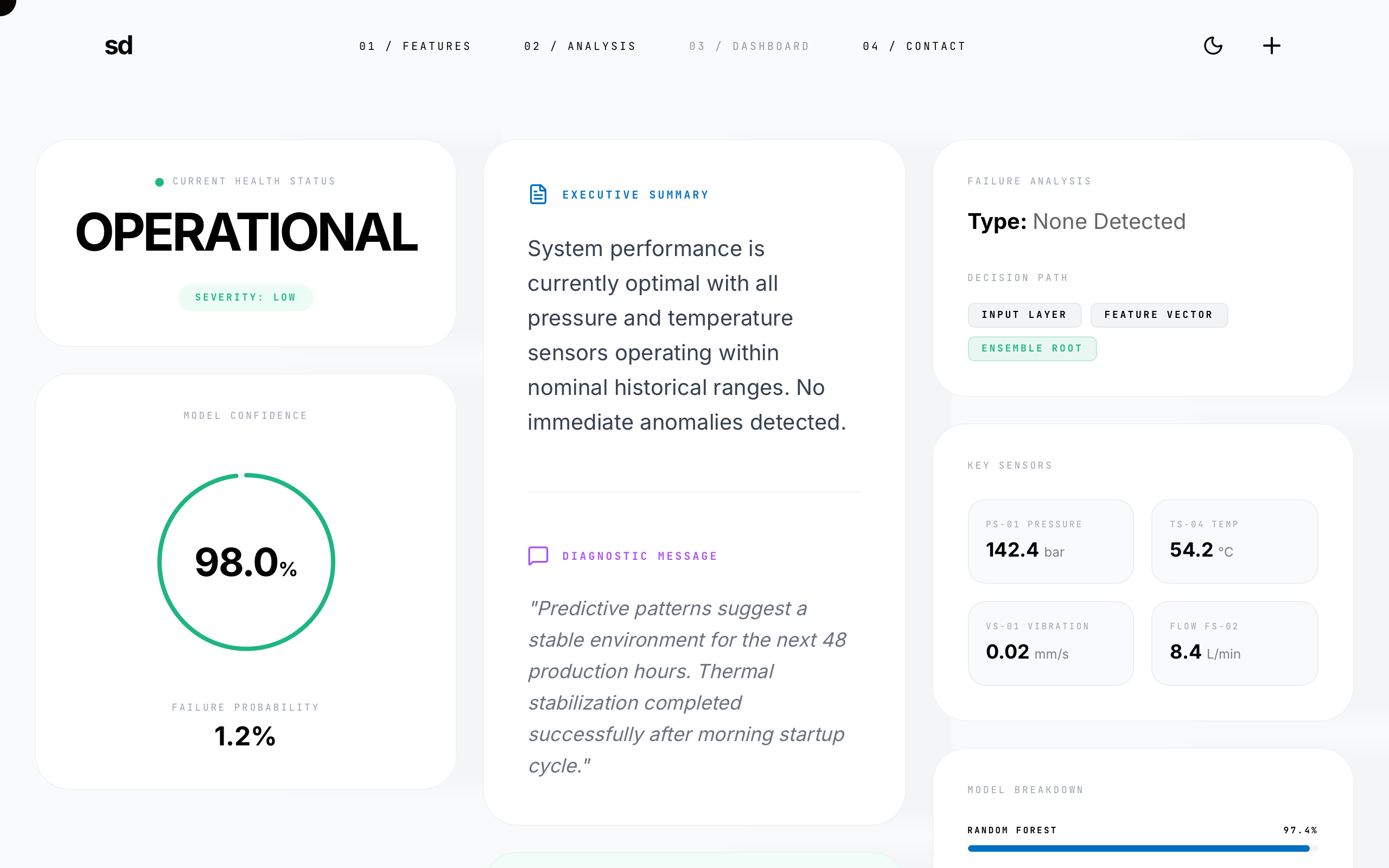
Summary
A high-contrast, editorial-style results dashboard designed for clarity and technical sophistication. It utilizes a clean grid system, heavy geometric sans-serif headlines paired with monospaced technical labels, and a distinct emerald-green accent for health indicators. The interface features a custom interactive cursor and smooth staggered entry animations.
Style
The design follows a 'Bold Editorial' aesthetic with a focus on information hierarchy and micro-interactions. It pairs 'Inter' for body and display text with 'JetBrains Mono' for technical data. The color palette is strictly monochrome (Black #000000, White #FFFFFF, Dark #0A0A0A) with functional accents: Emerald #1DB584 (Success), Blue #0070C0 (Informational), and Purple (Secondary Analysis). Animations are characterized by a precise cubic-bezier(0.16, 1, 0.3, 1) curve for 'reveal-up' effects and theme transitions.
Layout & Structure
A responsive 12-column grid layout that organizes content into three primary vertical streams on desktop. Top-level navigation is fixed with high-contrast interactions.
Navigation
Hero Status Section
Metric Column (Left)
Analysis Column (Center)
Technical Column (Right)
Components
Interactive Blending Cursor
A floating circle that follows the mouse with a lag effect and changes visual state over hoverable items.
Animated Circular Progress
A SVG stroke-based ring that animates on page load.
Monospaced Metadata Badges
Highly structured labels for technical data points.